Unipay - Logo design for the digital payment system

Here is an interesting opinion about logo 👇
Your brand's logo carries significant weight in distinguishing your business from others, while it doesn't necessarily have to have a specific meaning or connection to your brand.
However, the Outcrowd team knows that the story behind the logo can add an extra layer of intrigue and depth.
We believe that a well-crafted logo is like the icing on a cake, making your brand stand out even more.
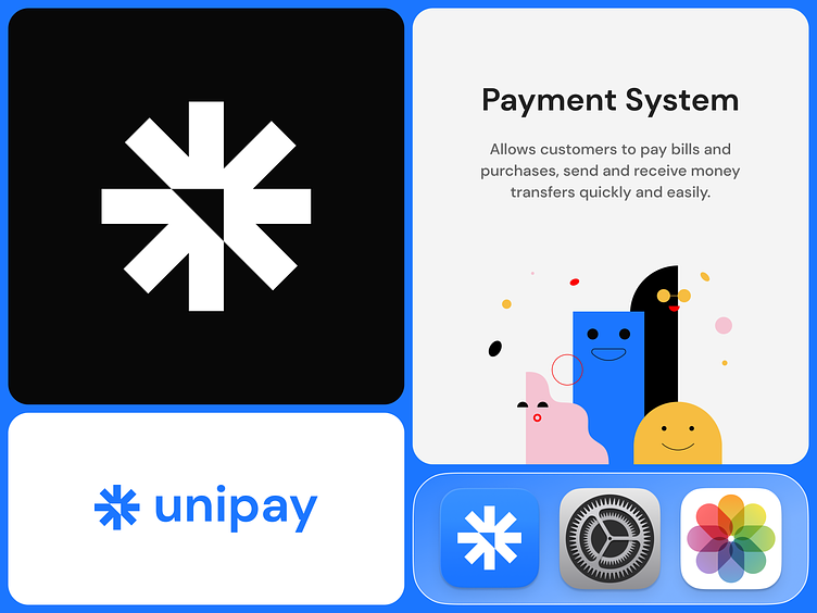
About the client
Unipay is a digital payment system. It allows customers to pay bills and purchases, send and receive money transfers.
Services we provided
Logo design.
Brand's visual guidelines.
Bank card design
UX/UI mobile app design.
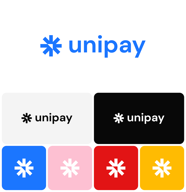
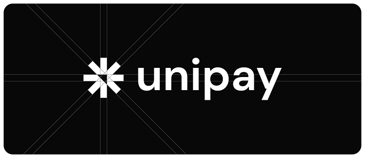
About the logo
The Unipay logo is simple in structure but carries many meanings.
It is an arrow that reflects the direction and positive dynamics. At the intersection of the two parts, a second arrow is formed and it is the image of the transaction.
The overall shape is a star as a click effect - describing the speed of the application and the ease of all operations.
The logo can be only 3 colors - blue, black and white. This makes it easy to use and makes it flexible and versatile.