Pic_normal

Exhibit One

Stff

7 Responses

  1. Pic_normal Lewis Newman

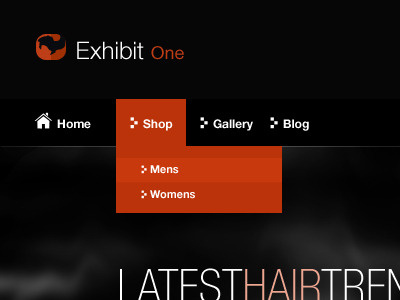
    Minimal design for a hair-dressing company.

    The aim was to get across important information, whilst also giving the website a sleek and professional feel.

    My first shot, mainly put in place to make my page not completely empty, I will upload more shots as I create them. :)

    10 months ago

  2. Avatar Daniel Sandvik

    Nice work, welcome to Dribbble buddy! :)

    likes

    10 months ago

  3. Max Max Ackermann

    Hi Lewis, welcome and thanks for sharing!

    I like the drop down, very bright and cheerful. Does what it's supposed to do. Personally, I find the use of the squarish triangle a bit repetitive, it attracts a bit too much attention to itself (especially in front of the Mens/Womens submenu).

    Also, the rest of the page looks nice and minimalist, maybe you could abstract the Home icon a bit more to fit the otherwise geometric style?

    Good job!

    likes

    10 months ago

  4. Matt Matthieu Dufour

    Welcome to Dribbble bro!

    likes

    10 months ago

  5. Pro Ted-imac-128 Ted Goas

    I agree with Max: the arrow doesn't really add anything for me. Plus it looks like a different icon set from the home icon.

    Overall strong start. Like the brown / orange color combo and the thin font adds a touch of class.

    likes

    10 months ago

  6. Pro Sascha_grau_2011_big_avatar2 Sascha M. Trinkaus

    very nice - very clean. welcome :)

    likes

    10 months ago

  7. Pic_normal Lewis Newman

    @Daniel Sandvik, @Matthieu Dufour, @Sascha M. Trinkaus Thanks guys, I appreciate it :)

    @Max Ackermann, @Ted Goas Thanks for the feedback guys, I will work on creating a new set of icons for this, which fit the minimal style better.

    10 months ago

More by Lewis Newman

keyboard shortcuts: previous shot next shot L or F like