Noor Khan

The theme of colonialism is something that has had a big impact on both Noor’s work and life, and so we explored mirroring visual elements of the British and French colonial style. And while this inspiration might be unexpected given the nature of their work, Noor enjoyed this duality and the re-appropriation of these styles into their own identity.
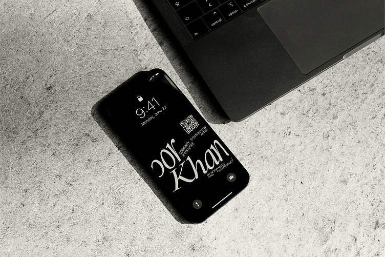
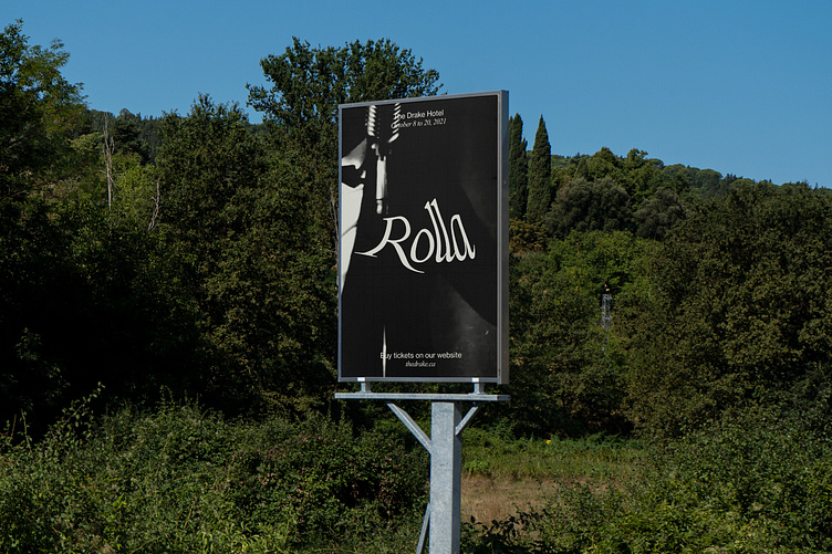
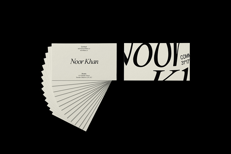
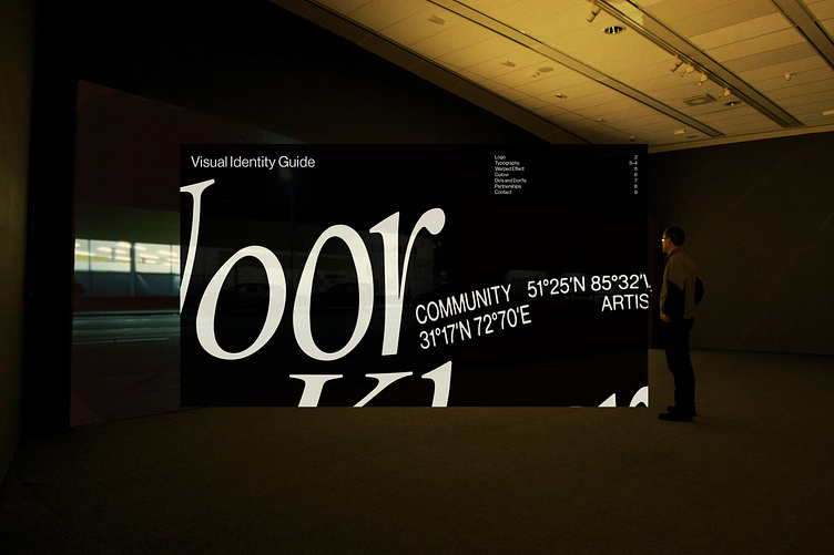
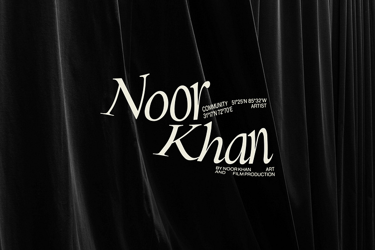
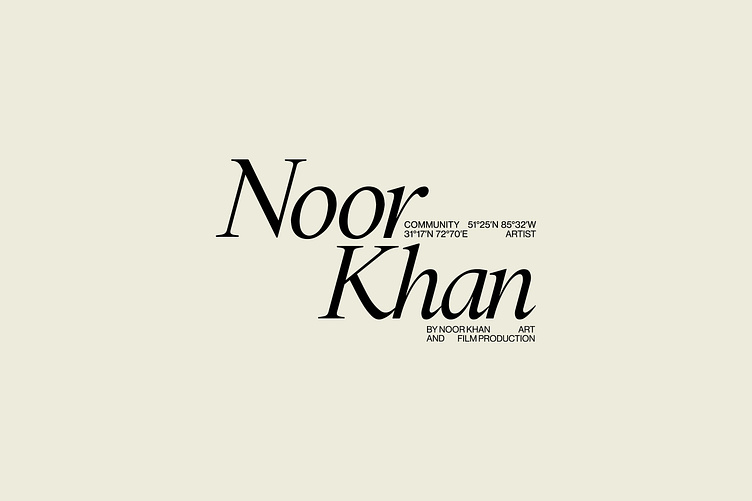
This started by creating a logo with a ‘stamp-like’ quality, referencing how we might imagine colonial-era documents and letters. Alongside this, we then used a series of digital manipulations to create a system of warped versions of the logo, to be used alongside the more ‘standard’ version.
This way, we could balance the historical inspiration behind the logo with a contemporary twist, reflecting the themes of past and present seen in Noor’s work. This also gives the logo the flexibility to dial up or down its degree of expressiveness - able to be used as a bold artwork and presentation of Noor’s name, as well as having a more understated, functional purpose.
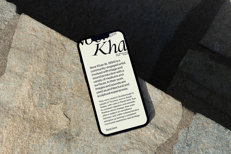
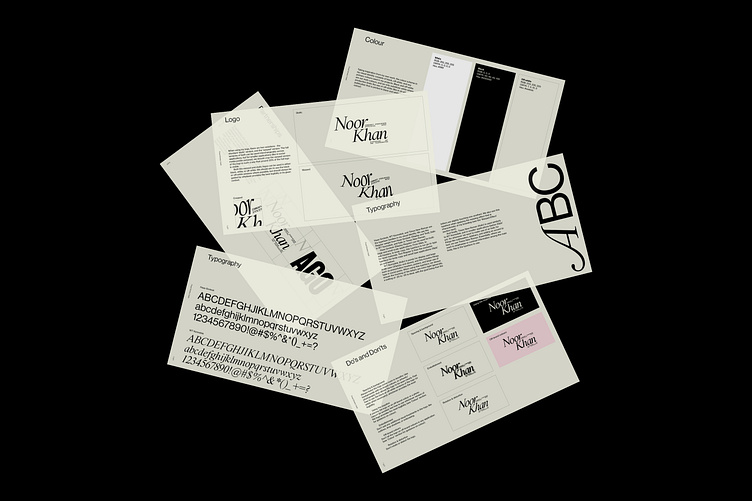
Continuing the theme of combining historical storytelling with a modern context, we chose 2 typefaces for Noor Khan’s visual identity: Haas Grotesk and WT Kormelink.
Noor’s work challenges us to confront the issues of the past in the present day. Typography was a huge part of translating this artist story into the visual identity, and we wanted to give Noor the brand tools to speak to both historical and modern contexts.
We also carefully considered how to carry this theme into the colour palette too, where we ultimately decided against a pure black and white colour scheme and instead shifted to pairing black with a ‘paper’ colour/effect, again referencing how we might imagine old documents and letters.
Our choice of secondary colours were also a direct reference to Noor’s work. The tangibility to the paper/off-white colour draws a connection to the physical/real-world aspect to Noor’s art, while a secondary palette made up of colours that recur in the art ensures consistency between their work and the visual identity made to represent that work.
Through our careful visual explorations, we created a brand identity that ticked all the boxes for us and for Noor Khan.
The identity reflects both the art and the artist, balancing the past and the present, and taking heavy inspiration from Noor’s personal story.
Especially with artists, creating a brand identity that speaks to the many facets of their work is a challenge. But we’re really happy with how this one came together 🎨
See more of our work at: fookcommunications.com