Find designers
Designer search
Quickly find your next designer
Post a job
The #1 job board for design talent
Inspiration
Courses
UX Diploma
Learn UX design from scratch in 6 months
UI Certificate
12-week UI skill building for designers
Live interactive workshops
with design professionals
Jobs
Go Pro
Log in
Dribbble: the community for graphic design
Advance your career with a Professional Diploma in UX Design
Learn more
Log in
Sign up
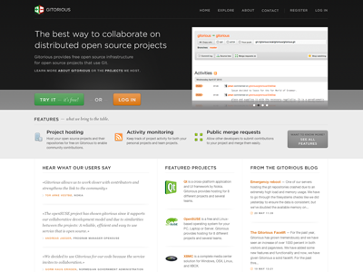
Gitorious.org
Ole Martin Kristiansen
Follow
Following
Like
#F5F5F5
#1A1A1A
#949494
#E6C6A7
#616161
#599F5A
#324E2E
#CB924D
Download color palette
After two and a half month of design and coding
Gitorious
is finally live!
git
launch
View all tags
Posted on May 21, 2010
1,777
0
17
8
View feedback
Ole Martin Kristiansen
More by Ole Martin Kristiansen
View profile
Previous
Next
Loading…