IU Health Campaign Page Improvements

This project was completed in 2022 for Indiana University Health
My Role - Product Designer
Tools Used: Sketch
Overview
IU Health employs a specialized type of web pages known as "campaign pages" for targeted marketing campaigns aimed at specific audiences. It's important to note that these pages are intentionally designed to be excluded from search engine results and are not searchable within the IU Health site itself.
Problem
The banner image on these pages presents a challenge as it utilizes a full-width image with overlaid text. This design approach often leads to images being cropped in an undesirable manner and makes the text difficult to read. The issue is further exacerbated on mobile devices, where these problems become even more pronounced.
Project Goal
To enhance the accessibility and flexibility of the banner image layout, to implement improvements that address these concerns. The goal is to ensure that the banner images are more inclusive and adaptable to different content needs. By adopting a more flexible approach, we can utilize various image sizes and proportions, preventing any distortion.
Additionally, it was requested I create a design for pull quotes that will make them visually prominent on the page. By implementing a distinct design for pull quotes, we can highlight key statements or testimonials, making them stand out and capturing the attention of users. This will contribute to a more engaging and impactful user experience.

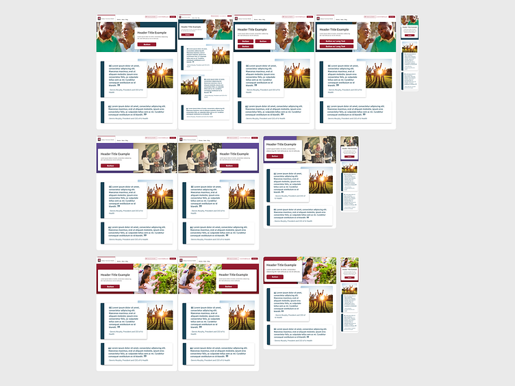
Banner Design
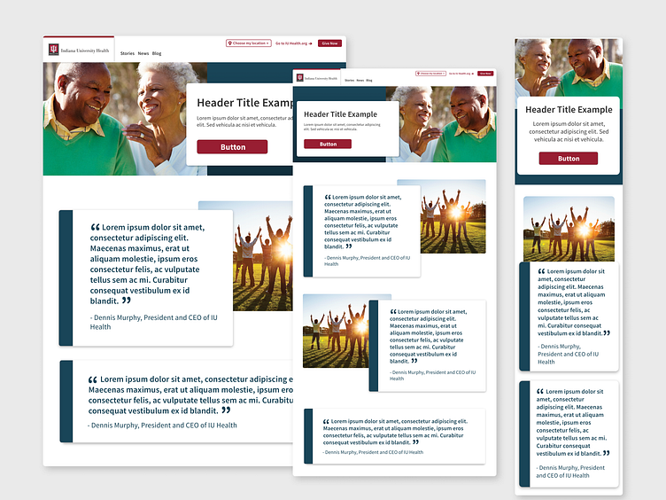
I used a 50/50 layout for desktop viewing. This layout divides the space evenly, allocating 50% to the image and the remaining 50% to a customizable color block that can be adjusted to complement the image. I utilized existing UI patterns from our website to create a card element that displays the text and call-to-action buttons. By positioning this card over both the image and the color block, we achieve a composition that integrates all the elements.
For mobile these elements stack with the card floating between the image and the color block. This allows all elements to stay in the proper proportions but also allows the for the text and call to action buttons to be easily seen without pushing the rest of the page content below the fold.
Quote Design
For the pull quote design, I developed two versions—one with a photo and one without. When including a photo, I incorporated the card design for the text, overlapping it with the image to maintain consistency with our call-to-action modules and create a unified visual style.
To ensure the pull quote stands out prominently on the page, I introduced a colored bar on the side of the card. This addition serves to elevate the pull quote, distinguishing it as a separate element from the surrounding text.

Development
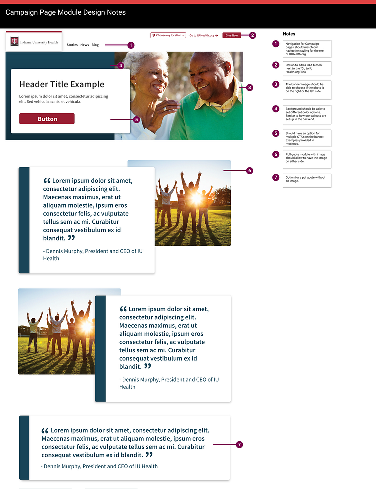
To facilitate a seamless handoff to our development team and ensure a thorough understanding of the design and its intended functionality, I prepared comprehensive documentation for the project. This documentation shows the design across different screen sizes, considering various use cases, including edge cases.
Furthermore, I created a detailed document that explains the design elements and includes interaction notes. This document serves as a reference point for the development team, providing them with clear instructions on how each component should behave and interact with user actions. It ensures that the design is accurately implemented, maintaining the intended user experience and functionality.
Outcome
This design has been successfully launched and the modules have been utilized in multiple marketing campaigns.