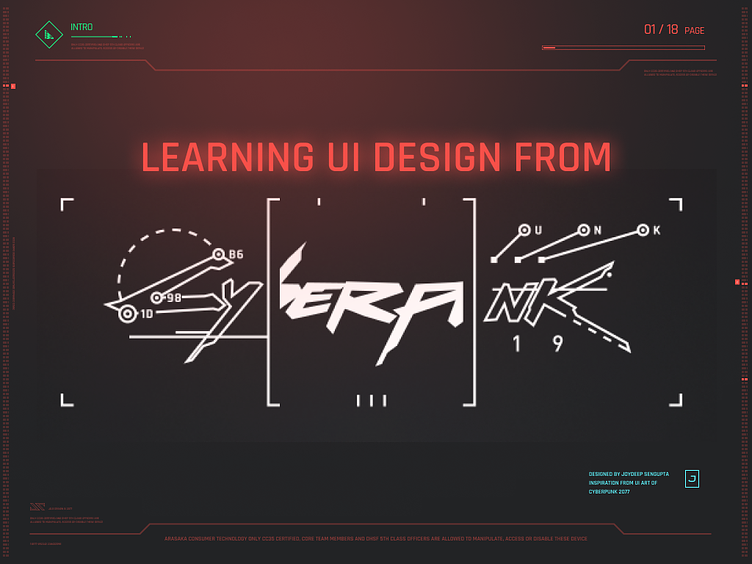
Cyberpunk 2077 PPT Template

After playing Cyberpunk 2077 for hours
it has easily become my new favorite game. While CDPR faced numerous challenges and bugs during its highly anticipated release, they have finally managed to deliver a somewhat stable version of Cyberpunk.
Beyond the awe-inspiring graphics and intricate mechanics that have already been extensively covered in videos and articles, what caught my attention was the game's interface design and UI. Not only does the game feature a wide range of interfaces, but the UI within the game's narrative also plays a crucial role. As a UX/UI designer myself, I am genuinely impressed and captivated by the exceptional quality of the design.
Interface Styles
Cyberpunk 2077 showcases four distinct sub-styles, each with its own unique aesthetic. These retro-futuristic sub-styles, reminiscent of the iconic Tron Legacy look, include Entropism, Kitsch, Neo Militarism, and Neo Kitsch.
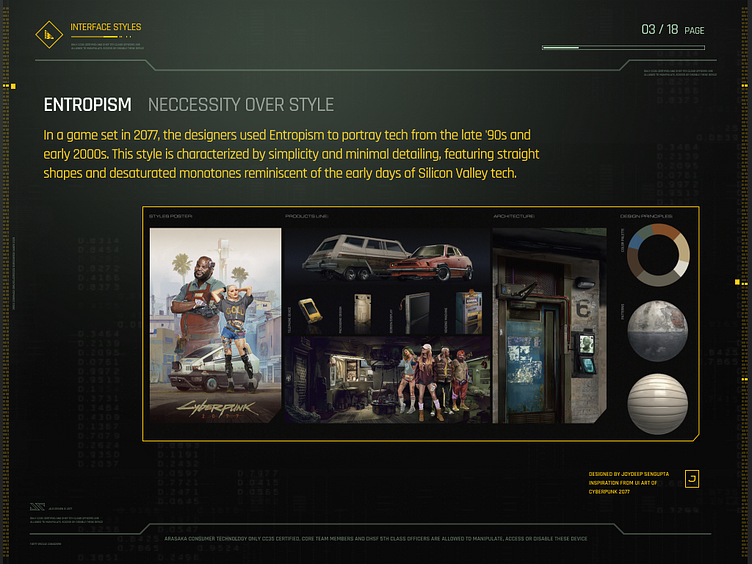
🔲 Entropism - Necessity over Style
In a game set in 2077, the designers used Entropism to portray tech from the late '90s and early 2000s. This style is characterized by simplicity and minimal detailing, featuring straight shapes and desaturated monotones reminiscent of the early days of Silicon Valley tech.
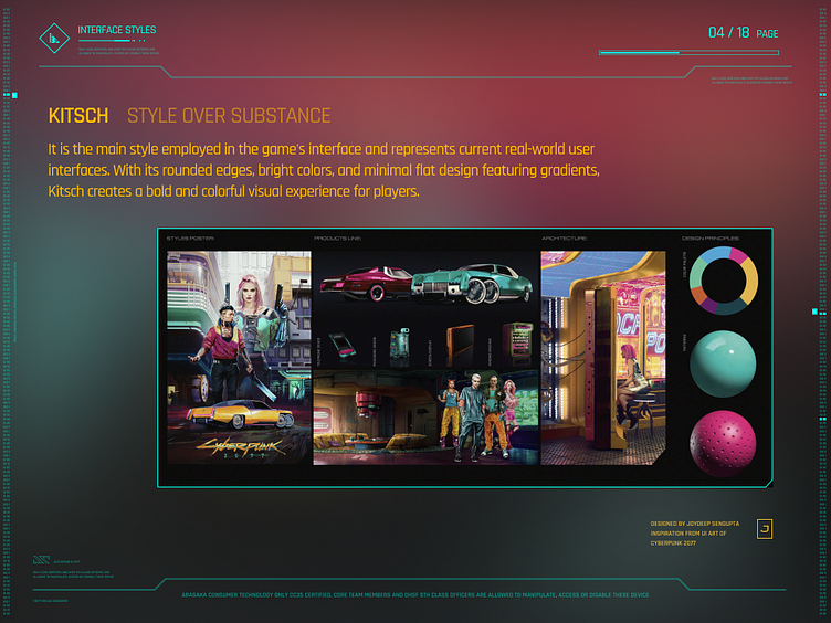
🎨 Kitsch - Style over Substance
Kitsch is the main style employed in the game's interface and represents current real-world user interfaces. With its rounded edges, bright colors, and minimal flat design featuring gradients, Kitsch creates a bold and colorful visual experience for players.
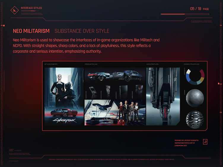
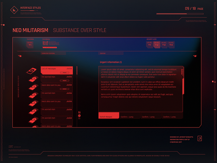
🛡️ Neo Militarism - Substance over Style
Neo Militarism is used to showcase the interfaces of in-game organizations like Militech and NCPD. With straight shapes, sharp colors, and a lack of playfulness, this style reflects a corporate and serious intention, emphasizing authority.
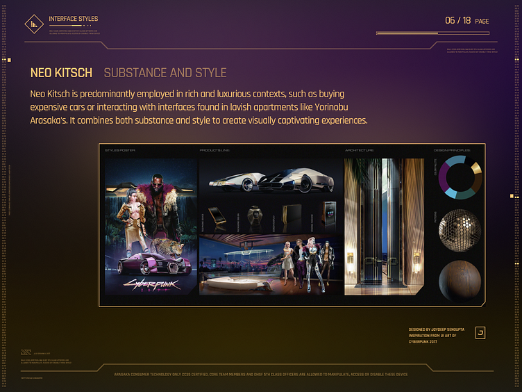
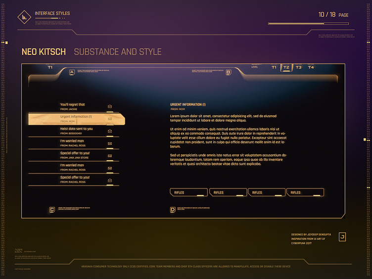
💎 Neo Kitsch - Substance and Style
Neo Kitsch is predominantly employed in rich and luxurious contexts, such as buying expensive cars or interacting with interfaces found in lavish apartments like Yorinobu Arasaka's. It combines both substance and style to create visually captivating experiences.
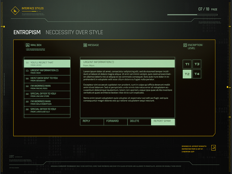
An email app UI designed in Entropism style
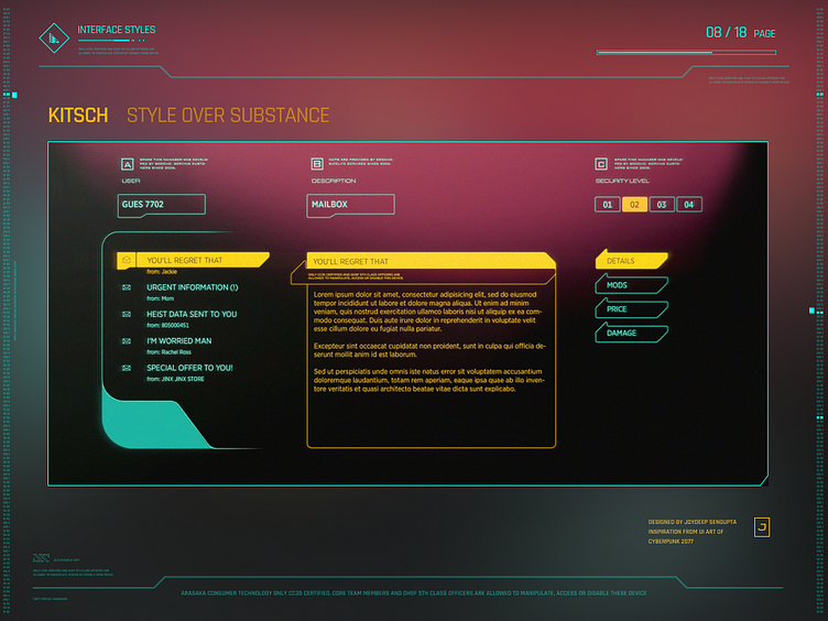
An email app UI designed in Kitsch style
An email app UI designed in Neo Militarim style
An email app UI designed in Neo Kitsch style
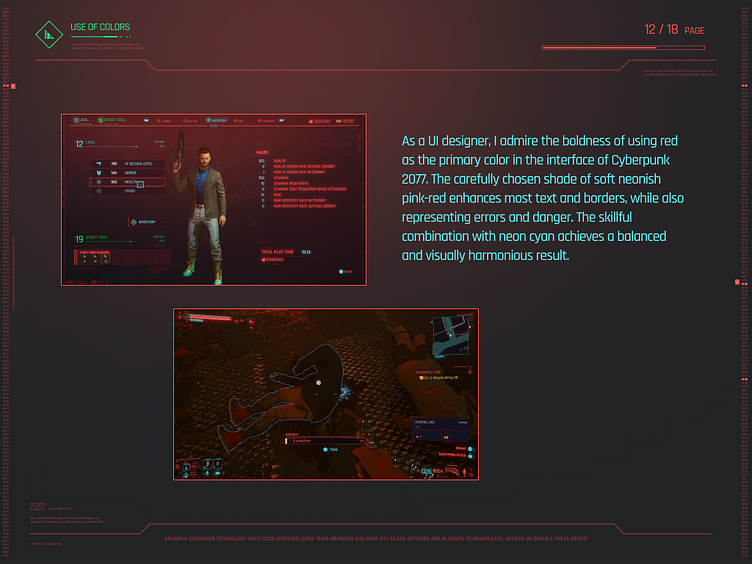
As a UI designer, i think it was very bold for them to use red as a primary color of the interface but they have done it very well. The shade of red that is picked is very soft and neon-ish pink red. Most of the text and borders on the interface is red, yet the errors and danger is also shown in red. It is very carefully used in balance with neon cyan to balance it out.
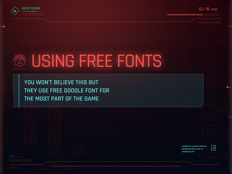
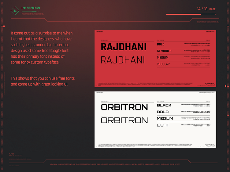
It came out as a surprise to me, when I learnt that these designers who have put so much attention to details and have such highest standards of interface design used free Google font has their primary font instead of using fancy custom typeface. They used Rajdhani and Orbitron for most of the part, i think its slighly modified but still it looks so good and professional. This shows that you can use free fonts and come up with great looking UI.
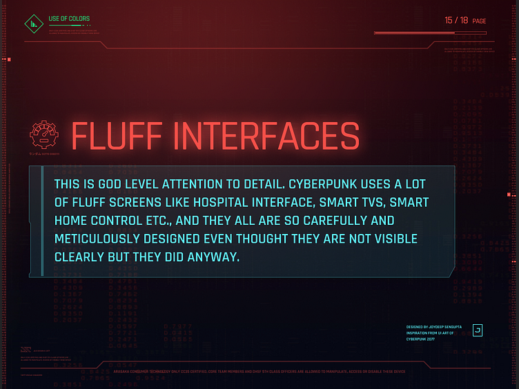
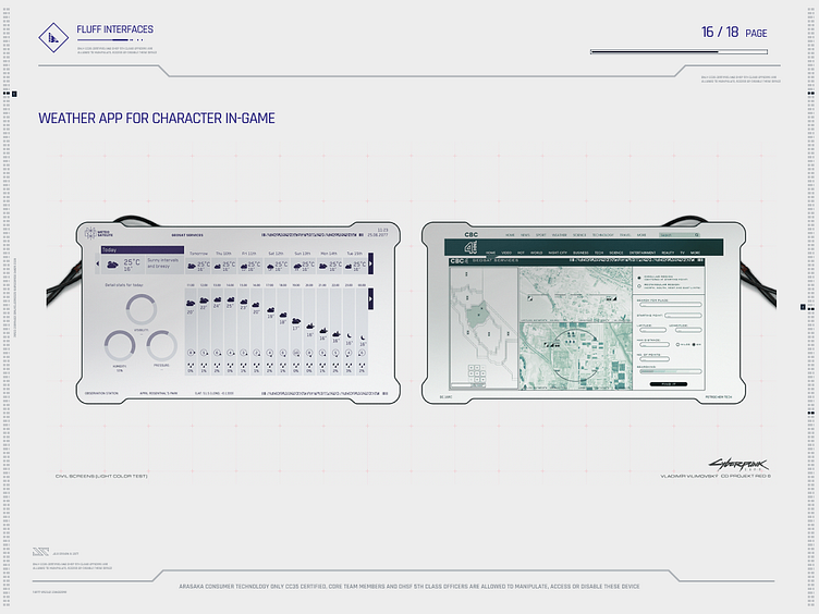
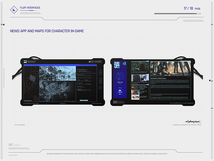
Cyberpunk 2077 showcases meticulously designed fluff screens, including hospital interfaces, smart TVs, and smart home controls. These thoughtfully crafted layouts provide valuable inspiration that can be implemented in real-life UI design. This shows the attention to detail in the UI art.
Download this template
You can download and use this PPT template for free from Figma community: https://www.figma.com/community/file/1242587221411969492
Credit where due
I'm totally geeking out over Cyberpunk and whipped up an epic PPT template for everyone to snag, no strings attached. Rest assured, there's no copyrighted stuff here—just a homage to the mind-blowing design language of Cyberpunk game. Massive thanks and full credits go to the visionary designers and UI artists at CDPR who brought this game to life. Enjoy the vibes, chooms!


