Find designers
Designer search
Quickly find your next designer
Post a job
The #1 job board for design talent
Inspiration
Courses
UX Diploma
Learn UX design from scratch in 6 months
UI Certificate
12-week UI skill building for designers
Live interactive workshops
with design professionals
Jobs
Go Pro
Log in
Dribbble: the community for graphic design
Advance your career with a Professional Diploma in UX Design
Learn more
Log in
Sign up
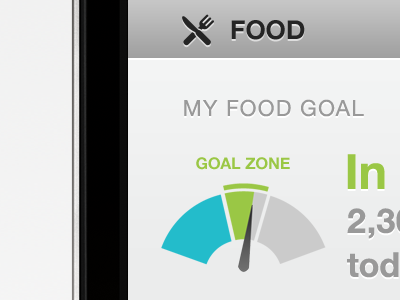
My food goal
Kerem Suer
Available for work
Follow
Following
Like
Get in touch
#EDEDED
#ACACAC
#090808
#26BBCA
#676665
#9CC849
#C0DCAB
#889865
Download color palette
Little somethin somethin that I'm polishing. Feedback appreciated as always.
app
dashboard
goal
icon
ios
iphone
ui
View all tags
Posted on Jul 17, 2011
9,157
55
184
8
View feedback
Kerem Suer
Welcome to my design portfolio on Dribbble
Get in touch
More by Kerem Suer
View profile
Previous
Next
Loading…
Loading…
Loading…