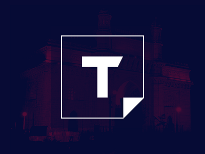
Themeist Logo
Some ideas used in earlier version (https://dribbble.com/shots/1646252-Themeist-Logo?list=users&offset=3).
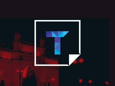
I have added small touches, such as a cutout near the corner to make the fold appear properly even when the logo is used in a small variation. The "T" now has more colors as it's supposed to represent User content so I wanted to highlight it.
- Simple & clean to reflect my work (themes)
- The "T" is shaped unevenly to denote a "Hammer". To convey the products as a tool.
- The corner fold is to denote a sticker. Themes should be easy to apply and remove as a sticker. So wanted to somehow convey that in a logo.