Birster Organic Gin — Packaging & Hero

Brand identity for one of the first organic gins in Québec.
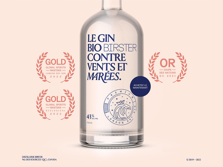
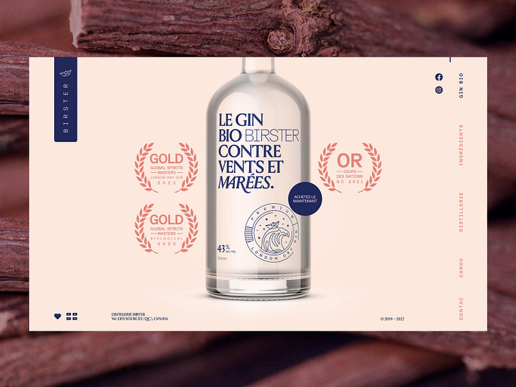
Making a 100% organic gin is complicated. From government compliance to picking the right grains, it's everything but choosing the easiest path. The challenge was to convey the resilience of the Birster brothers in achieving their goal of making an organic gin without any compromise.
We decided to embed a bold statement directly onto the bottle label, which reads "THEE organic gin, against all odds" (free translation). The Birster word mark is voluntarily faded out, using a thin font, so you omit it at first read.
View the full case study on Behance
birster.ca
Give it some ❤️ by typing "L"
Follow me:
Designing Rad Banner Ads Since AltaVista™


