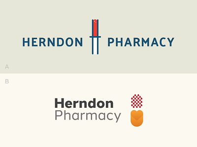
A or B?
In progress...working up an identity for a local pharmacy that specializes in hemophilia care.
Their mission – Herndon Pharmacy exists to provide factor products to persons with various bleeding disorders. It is our intent to provide these products and services with honesty, integrity, and “true customer service.”
Would like some feedback and which version is preferred. I lean more towards "Option B" in that it reflects more like a 'pill' but shows droplets of blood falling into the other end of the pill with a heart (care/true customer service).
Option A plays off an H with blood in the top half and nothing in the lower half to show it has been contained.
Let me know what you think and which option I should show this Friday. Thank you everyone!


