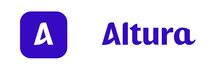
Altura, bid management platform

Dutch based Altura is a bid management platform for companies that want to win tenders.
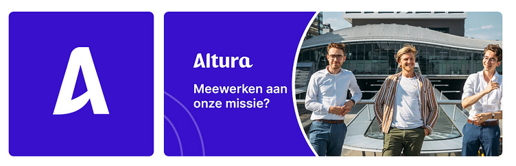
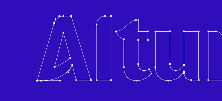
Together with Matthijs Huiskamp (CEO and Founder of Altura), we build Altura a beautiful custom logotype that represents; knowledge, trust and innovation. (included a small breakdown)

Exploration
With a general sense of direction, I started off with a few directional sketches. Mainly a mixture between sans-serif/script and serif/script.
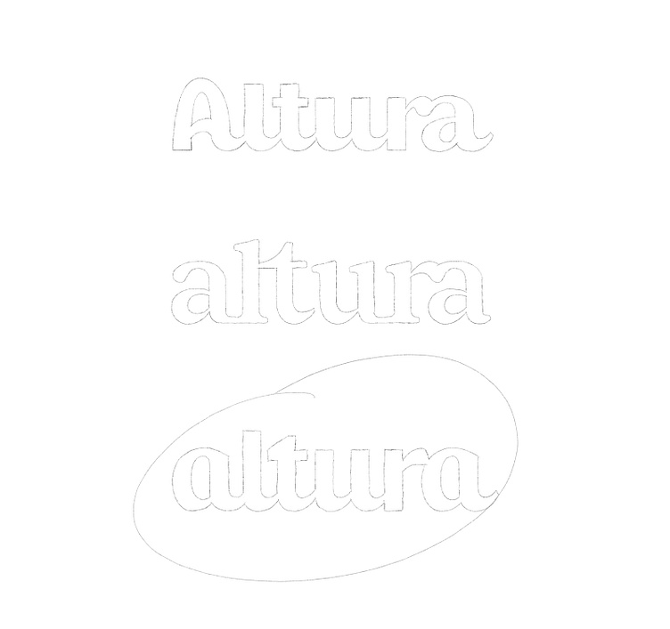
The last one ticked many boxes in terms of weight and style, but a few improvements were needed.
Change to an uppercase "A" character and make it the stand out letter.
Disconnect the letters to gain improved readability
Add subtle unique elements, like rounded corners etc
Development
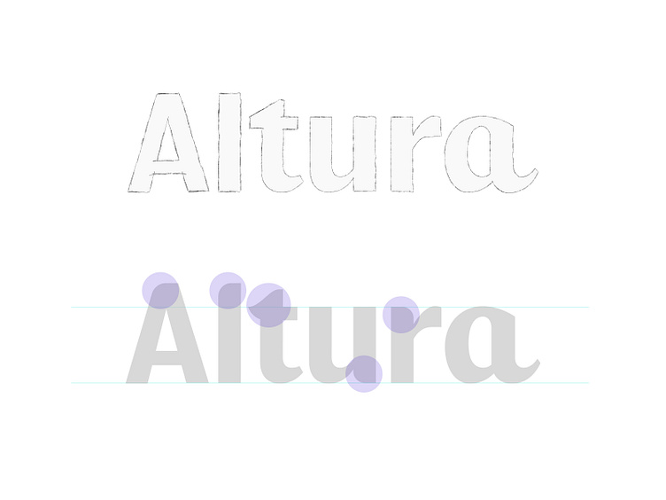
Because I won't be doing a direct trace, a quick mock up sketch was enough to see how the characters would look when separated.
When everything was transferred over to Illustrator, I was able to add a few unique elements to the characters by rounding up the corners.
The A..
Now it was time to spice up the "A" a bit, and quickly came to the idea of lifting the stroke upwards, mimicking the upward motion of the "u" and the lowercase "a".
This would also symbolise growth, progression etc, and would play nicely with the Spanish definition of the word Altura, which is height.
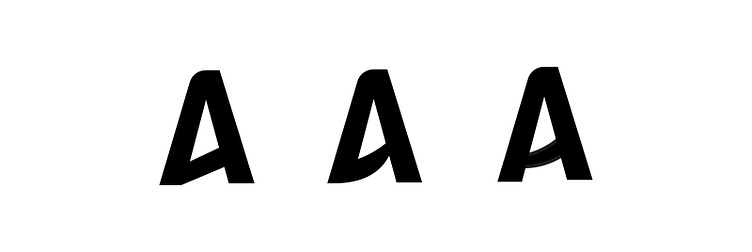
The middle one compliments the "u" and "a" the best, both from an angle as from a weight perspective.
paulvonexcite.com — info@paulvonexcite.com


