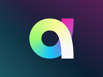
a
Introducing the innovative logo design for the company named "a" – a striking representation of simplicity and fluidity. The lowercase letter 'a' is gracefully crafted into a seamless loop, symbolizing a smooth and unbroken path, reflective of the company's effortless approach to overcoming challenges.
The captivating gradient infuses the design with a sense of playfulness and warmth, making the brand feel approachable and friendly. This sophisticated logo embodies the perfect blend of elegance and modernity, serving as a visual reminder of the company's commitment to providing exceptional solutions and fostering strong relationships with its clients.
--------------------
🚀 Let's create something big together! 🚀
Contact Unfold at unfold.co/contact
Follow us on Twitter | Behance | Instagram | YouTube
More about us on unfold.co
Posted on
May 10, 2023
More by Unfold View profile
Like


