Dutch Housing Co. - Logo Design

Dutch Housing Co. - Logo Concept
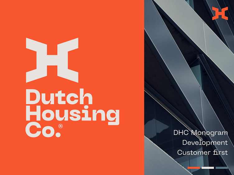
Dutch Housing Co. is an independent real estate developer that also constructs homes in order to facilitate sustainable and healthy living in a customer-oriented manner.
This specific concept started with the combination of the letters DHC. In a symmetric and abstract approach.
Would love to hear your quick feedback and thoughts on this concept direction.
Hit L for support!
___________________________________________________________________________________
___________________________________________________________________________________
Let's work together and elevate your brand! 🚀
Feel free to reach out via Dribbble DM or E-mail:
👉 info@jeroenvaneerden.nl
💼 Connect with me on LinkedIn / Read my Client Recommendations
🎬 Check my YouTube for Logo Tutorials / Learn Logo Design
🔗 Follow me on Instagram / See BTS and New Content
🛒 Buy my pre-made or unused logos from the portfolio
💬 Tweet with me


