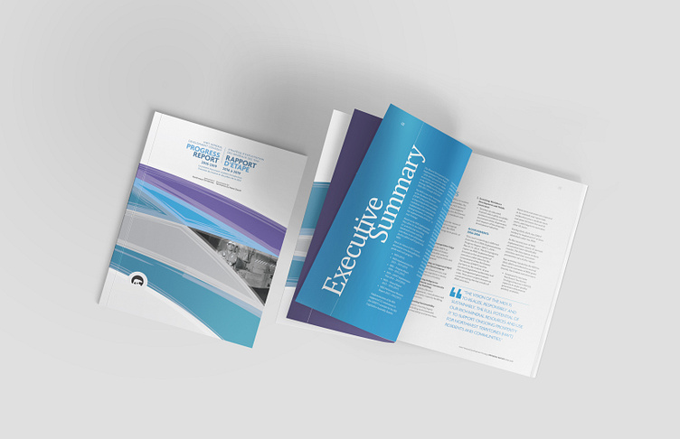
NWT Mineral Development Strategy Progress Report

Problem: Design a Report that looks professional and conveys an invitation to read without the use of photos and is heavy on text content and tables, while adhering to a brand identity guideline.
Solution: Play with type and colour, utilizing white space to create interest and an invitation to read.
I love white space, it always makes a layout feel like it can breathe. Playing with the sizing of numbers on this layout while using colour to add "pop", line after line of text now has structure, hierarchy and visual interest.
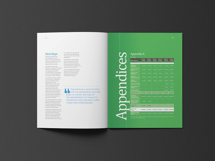
I also love colour. Too much white and the reader is lulled to sleep -- a full page background colour plus some vertical typography brings energy to this layout. Now it is hard to miss.
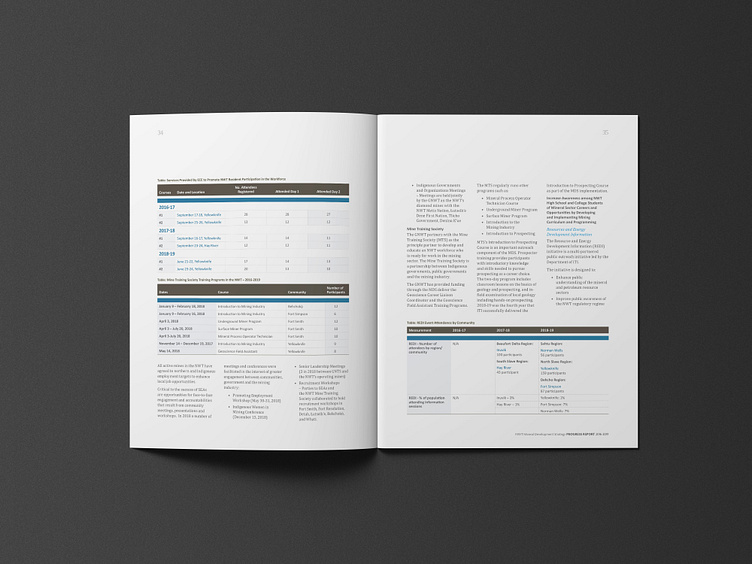
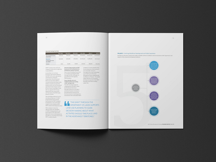
Even tables can be beautiful. Again hierarchy, structure, strategic use of colour on cells and rows. Just enough to again, add visual interest to the layout.


