:: PEACH ::

Two girls arrived at the study with a lot of enthusiasm and energy to create a brand for a healthy market; this brand had to be young, fun (because healthy doesn't have to be boring) and above all, very natural.
We started working from the streets, conducting a local and regional research that gave us the guidelines to begin.
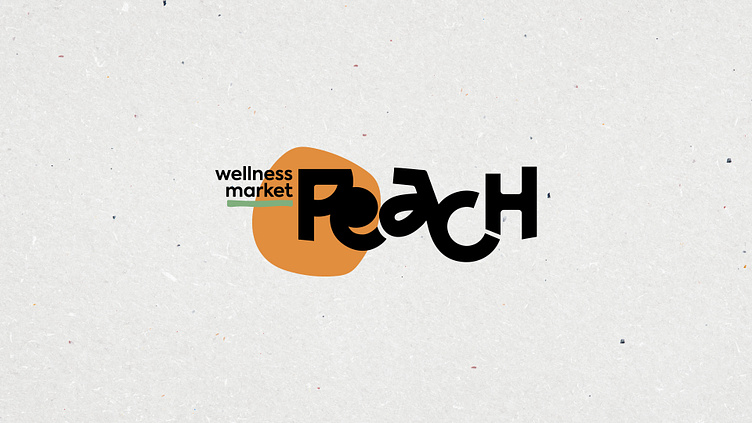
The logo was built from a typographic join that reflected the connection between the store and the consumer; the color palette allowed us to look fresh, cool, and confident. The abstract shape in the logo symbol is a peach in its minimal expression, and the graphic system continued the dynamic with organic contours.


