Branding Design

Branding for an American family-owned enterprise based in the Bay Area. Combining sustainability, reliability, and safety, Ethos Environmental offers cleanup and abatement services for residential and commercial spaces across California.
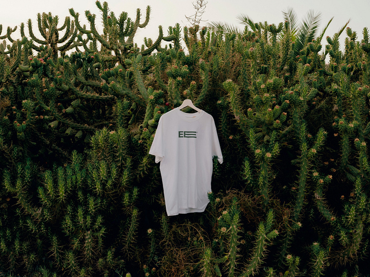
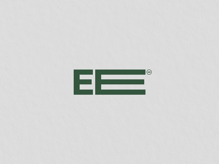
In order to align with Ethos Environmental values, a new logo was created. The result is a minimalist yet memorable and modern solution that makes the company stand out among competitors. The typographic logo communicates the company’s expertise, credibility, and safety through its bold nature, while the green color highlights its sustainable approach. The submark is an abbreviation of the full name with the second E modified. The idea relies in presenting abbreviated letters in a way to correspond to the company’s name length — thus, the short E stands for Ethos, while the long E stands for Environmental visually repeating the word’s length.
See the full project on Behance
_______
Services: website
Follow me on Instagram
Inquiries: contact@katezest.com


