She liked me. I could feel that. The way you feel when the cards are falling right for you, with a nice little pile of blue and yellow chips in the middle of the table.
This is really sweet! I had a notebook that looked like this once. I think you've nailed the style perfectly, but I do think that some of the edges are a bit harsh. the edge on the bottom of the label could be roughened-up a bit, as well as the shadow under the binding tape at the top.
To add to Brian's thoughts - texture and style work: great! But those little cuts in the label, how would that happen? Would it not make more sense for them to be small rips or bits torn out?
The edge of the label does seem a little hard (same goes for the rips)... I like the idea @Tom suggested. Those textures are spot on, I though it was a photo at first glance.
19 Responses
Pro
Dave Ruiz
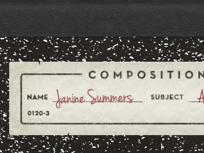
The header of a personal blog template that I am working on. This took me a while, as all textures (minus the leather) were made from scratch.
almost 2 years ago
Pro
Tom Creighton
She liked me. I could feel that. The way you feel when the cards are falling right for you, with a nice little pile of blue and yellow chips in the middle of the table.
almost 2 years ago
Pro
Brian Potstra
This is really sweet! I had a notebook that looked like this once. I think you've nailed the style perfectly, but I do think that some of the edges are a bit harsh. the edge on the bottom of the label could be roughened-up a bit, as well as the shadow under the binding tape at the top.
almost 2 years ago
Pro
Dave Ruiz
Thanks for the suggestions, Brian!
almost 2 years ago
Pro
Tom Creighton
To add to Brian's thoughts - texture and style work: great! But those little cuts in the label, how would that happen? Would it not make more sense for them to be small rips or bits torn out?
almost 2 years ago
Pro
Dave Ruiz
Funny, you mention them, Tom. The more I look at them, the more I am not too fond of them. Will remove for the final version.
almost 2 years ago
Love this, very much!
almost 2 years ago
This is sick Dave. I have a little obsession with composition notebooks so I automatically heart it.
One thought - what about blue ink instead of red? Maybe it could appear more realistic.
almost 2 years ago
Pro
Joel Jenkins
Muchos Bueno
almost 2 years ago
Pro
Dave Ruiz
Tried it, Gedy. Didn't pop enough. I agree with you though. That was my first thought as well.
almost 2 years ago
Pro
Steph Tekano
Is that a font or handwritten text?
almost 2 years ago
Pro
Dave Ruiz
@Steph: Font
almost 2 years ago
This looks slick, Dave.
almost 2 years ago
The edge of the label does seem a little hard (same goes for the rips)... I like the idea @Tom suggested. Those textures are spot on, I though it was a photo at first glance.
almost 2 years ago
Very very cool!
almost 2 years ago
Pro
Steph Tekano
Which font?
almost 2 years ago
Pro
James ✌
What is that script font? I NEED IT!
almost 2 years ago
Pro
Gustavs Cirulis
I love both of those fonts. What are they?
over 1 year ago
Pro
Jérémy Paul
May I asked what type you used ? The whole style looks very nice !
11 months ago