FenX - Brand Guidelines


Insulation Reborn from Ashes
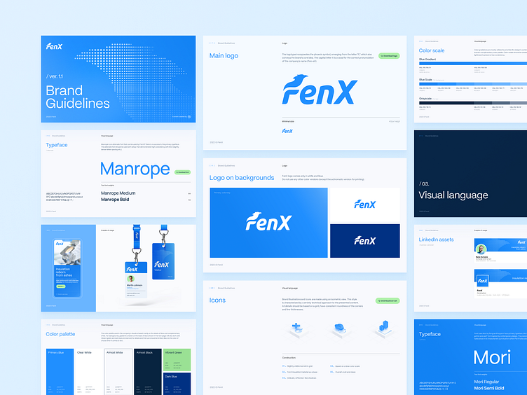
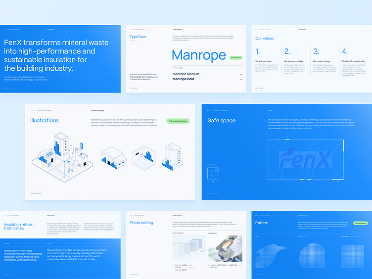
The FenX logo captures both - the essence of the company's technology and it's far-reaching vision. It refers to the mythical bird, a Phoenix, which, after reaching old age, could continually be born again. This demonstrates how FenX's remarkable technology works. Created directly from mineral waste, it can provide value again as a sustainable insulating material and serve for the years to come. FenX produces a material of the future that meets the needs of today's world.
Our Role
We helped FenX reinventing their visual language, logo and website. After a few rounds of adjustments, the logo passed a significant upgrade - it's more professional, balanced, has better proportions. We have given the brand's color palette a hierarchy and enriched it with vibrant green. Smooth gradients and subtle textures also play a part in brand perception - technology becomes more tangible, humane.
Remember to hit "L" if you love it 💙
__
Elevate your brand with us.
Feel free to contact us - studio@hehe.studio


