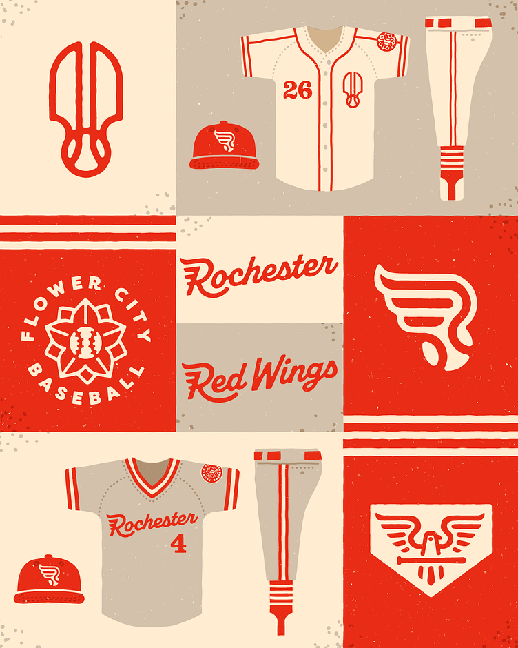
Rochester Red Wings

Part of my retro Rochester sports rebrand, giving each minor league team a mid-century inspired redesign.
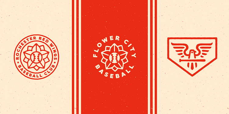
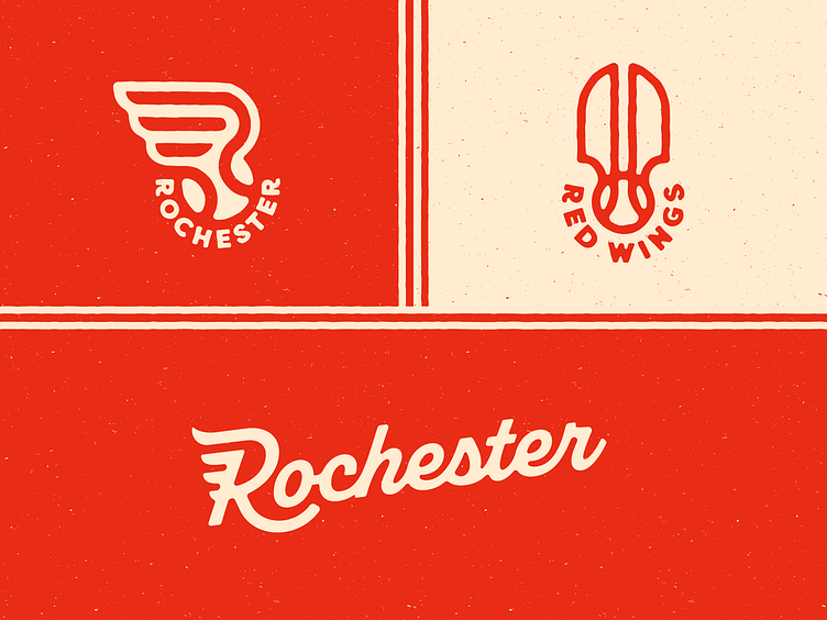
The Red Wings are the oldest continuously operated non-major sports team in America, so I wanted to give them a timeless look that focused on the color in their name - RED. No more black.
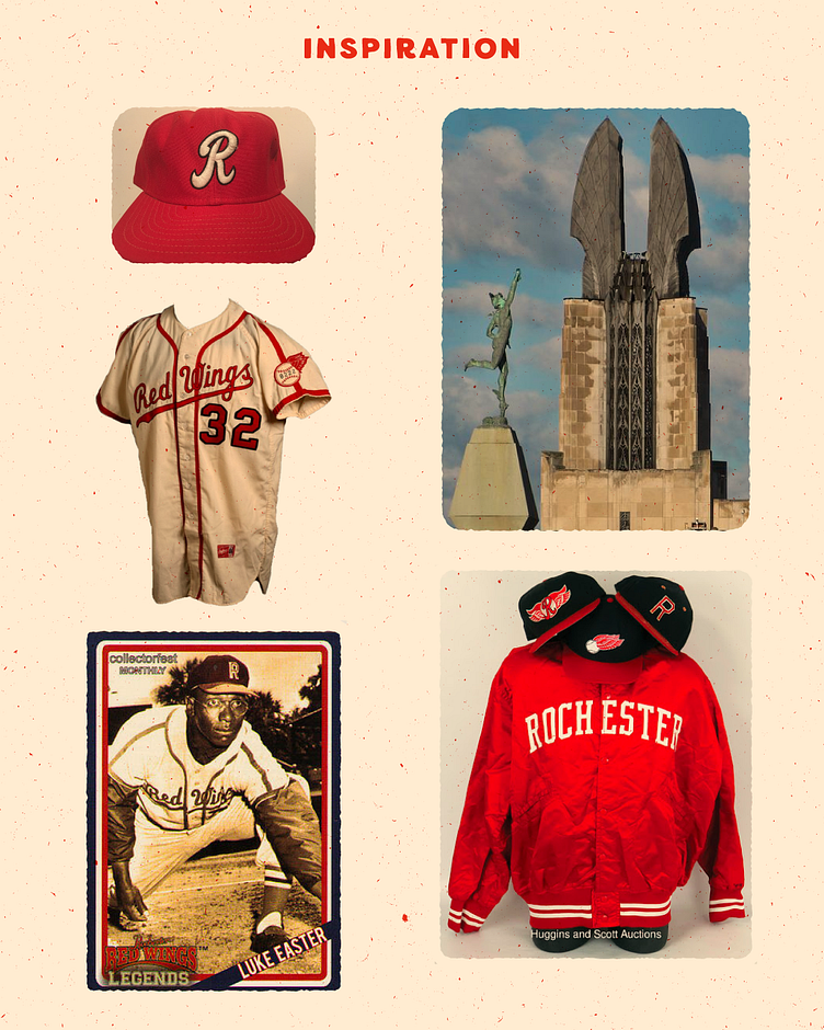
The profile flying wing and ball logo takes inspiration from an early flying ball logo in their history, while the double wings logo draws from the iconic Times Square building overlooking downtown and their ballpark, with its art-deco "Wings of Progress."