Montana Flag Redesign
As a native Montanan, I've thought about this one quite a bit. I even argued with my late father, who was in the legislature when the word "MONTANA" was added in the 80s (in Helvetica, it's in the law!) that if you have to add a word, it's not working. Besides, where is ANATNOM? (That's what shows when the flag is seen from reverse.)
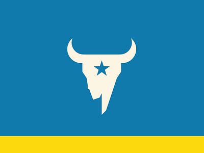
I think the bison skull is a unique and strong symbol for the state. Many people initially find it morbid, but the reality is that it's been associated with Montana for years, it is our brand, just as the cowboy on the bucking bronco is Wyoming.
My twist was to add a star, basically a nod to the fact that we're one of the stars on the American flag, and I thought it looked neat. I used a bone color rather than plain white, and a non-symmetrical skull like what CM Russell used in his art.
The left side of the skull is meant to reflect the unique shape of the western border of the state.
Color-wise, there are many navy blue state flags. I went with a color used by the Great Northern Railroad on a train design they had for the Glacier Park rails. The color itself is called "Big Sky Blue." I only had a stripe at the bottom in order to make the Big Sky Blue as big as possible.
The gold on the bottom represents the land and keeps the tradition of having blue and gold in the flag. (Take that, Griz fans.)
I don't know if this is THE solution. But I like it. The skull could use some tweaks, for sure. But the cool part is that it could be used by itself as a branding item for the state.
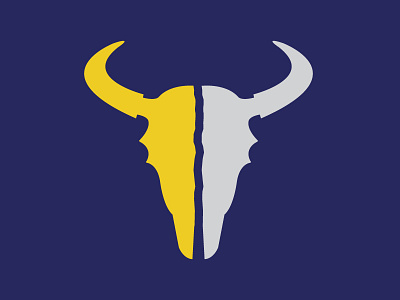
I'll admit I never thought about separating the sides and doing Oro Y Plata literally like you did. It's unique and definitely an option worth considering!
(I realize this comes months after you published yours, but better late then never.)