Hartford Public Library - concept design 2

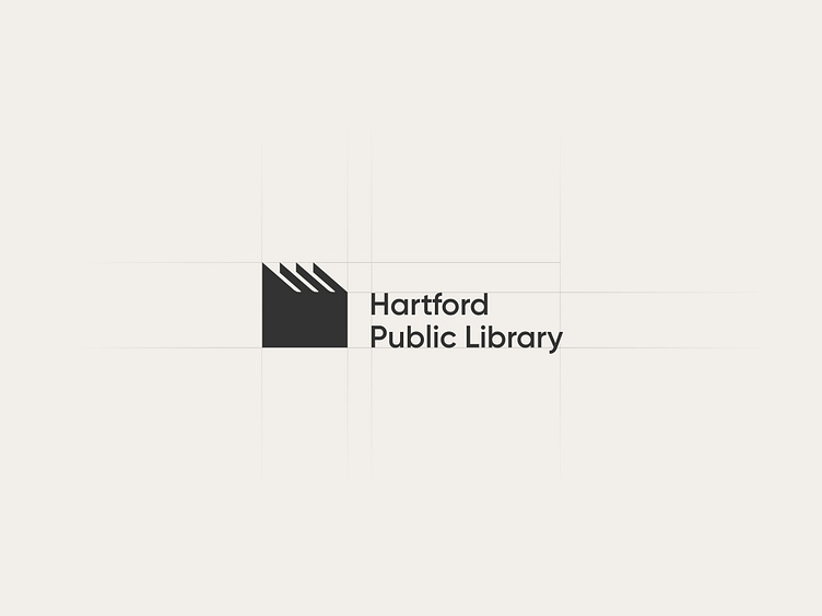
This captivating logo design showcases a clever combination of books forming the silhouette of a house, with the compelling tagline, "House of Books."
The resulting imagery masterfully represents the library as an institution of learning and personal development. The house, a symbol of security, stability, and community, signifies the library's role in nurturing and supporting the people it serves.
The logo reflects the library's commitment to gathering, conserving, and sharing knowledge with the community, making it a beacon of intellectual advancement.
Overall, the logo design embodies the institution's dedication to growth, inspiring users to embrace educational reading.
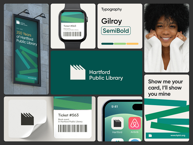

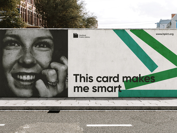

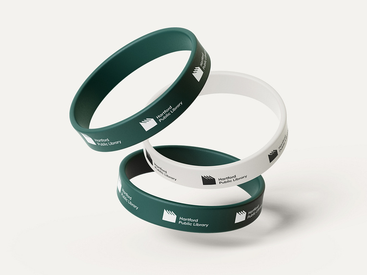
The interplay of dark green, beige, and orange creates a dynamic and potent color palette that emanates a welcoming and warm ambiance.
The combination of these hues instills a sense of both calmness and liveliness.
Dark green and beige tones elicit a feeling of tranquility and comfort, while the addition of orange introduces a playful and energetic element. Together, these colors harmonize to form an inviting and engaging environment.
Like and comment if you liked our design, or email us at ✉️ friends@flexy.global!


