Egnosis logo concept V4

Hey everyone,
During the Egnosis rebranding and logo design process, we came up with a bunch of different concepts.
This was the final concept we showed the client!
We'd like to hear your thoughts about it.

This concept was called
From Shapes
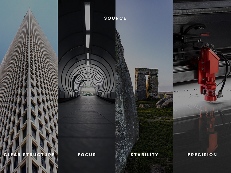
The concept is based on two main geometrical shapes: circle, square, and their incisions. The symbol is built upon a five by five grid and gets its final form by the shapes cutting through each other precisely. At first glance, it may appear playful due to the negative space and the interruption of the circle. But, a closer look reveals the engineering precision; the perfect proportions suggest stability and focus that reflects the brand’s mindset.