Design Systems Case Study (Shuddle)

The Case Study
This was part of the final submission to Dribbble’s ‘Design Systems Course’ created by Dan Mall. With the help of several mentors, this 8 week course taught the best practices and strategy in creating a scalable and flexible Design System. The following case study is the 2nd part of the IPTS final submission, to prove Design System scalability.
Context (Project Brief)
Your leadership at the IPTS—the Interplanetary Travel Syndicate—just hired the prestigious branding firm MegaBrand to do a rebrand of the entire organization, and there are a few things that’ll affect the three products you’ve been working on.
MegaBrand discovered through focus groups that the IPTS name and logo felt very ominous, like it was cold, faceless corporation that was always watching. (“The eyeball-shaped logo doesn’t help,” said one candid participant.) In addition, the IPTS wants to appeal to a younger demographic.
After weeks of research and exploration, they’ve settled on the new name “Shuddle,” which feels more like a cool, new startup.
The 3 main products have also been renamed to feel more like a family of products instead of independent offerings:
Update your products to this new branding.
==============================================================
Goal
To prove that the Design System created for the original IPTS product is also scalable for the new product, Shuddle.
But with the Design System now in place, it was just a matter of quickly updating the ITPS library components with the new Shuddle ‘language’
==============================================================
Updating the Components
Again, I first looked at the typography Atom. I had updated my current typeface of Inter with IBM Plex Serif and IBM Plex Mono, which was fairly straightforward.
However the color palette of the Shuddle system was much more expansive than what I supplied for IPTS...
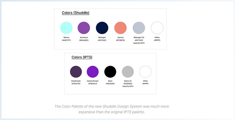
I would decide upon 'Amethyst' as my Primary Color for actions, with 'Midnight' following up a body copy color. The others I had left as highlight colors when needed.
Changing the typography and color palette set me up fairly quickly in updating the smaller molecules(i.e. buttons, tabs, text inputs), and the components seemed to adjust nicely...

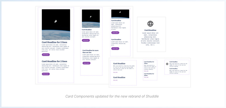
This also included the larger molecules of cards. Note the removal of the stroke on the bounding box of the card components. This was by artistic design, as it was in keeping to the refresh of a making the new brand more current with its audience. Having a more 'unbound' and open feel seemed appropriate.
==============================================================
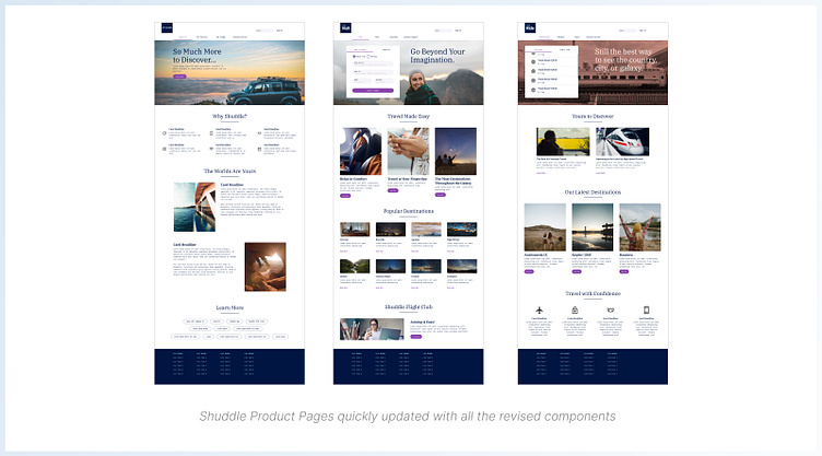
Final Words...
The fact that I was able to make large sweeping changes to the
Design System and create a brand new product site does prove that this system is scalable. More importantly, while there may have been slight updates to designs such as padding spacing, and time spent on defining the appropriate primary colors, the time spent overall was practically next to nothing.
And while the product site and component library can most certainly be expanded upon with UI elements such as tags, dropdown menus, date pickers, etc. The base library does appear to be that solid framework from which such new features can be derived from.


