Fomses | Case Study

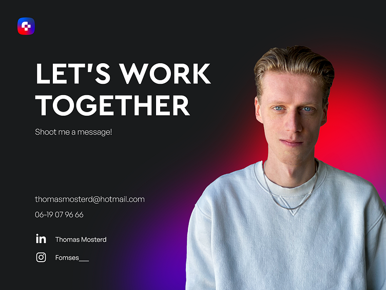
I have an announcement to make!
I started my own company called Fomses!
In this post I will break down how I made the brand guides and explain how I got to the end result.
The Research
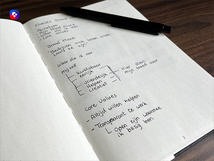
First I started with exploring what my brand stands for, including my mission and vision.
I wanted to make it personal because it is my own brand, and it should allign with what I stand for.
Mission:
"Help companies be who they truly are."
Core values:
My core values align well with what I stand for:
I want to always help.
Being transparent with what I am doing.

Archetype
The Magician
The Explorer
Fomses is a Dreamer Brand.
Traits of a dreamer brand are:
Curious
Creative
Fearless
Dreamers give a new experience; they become their own category.
Dreamers try to break the status quo. They ask you to think differently and help you make that reality come true.
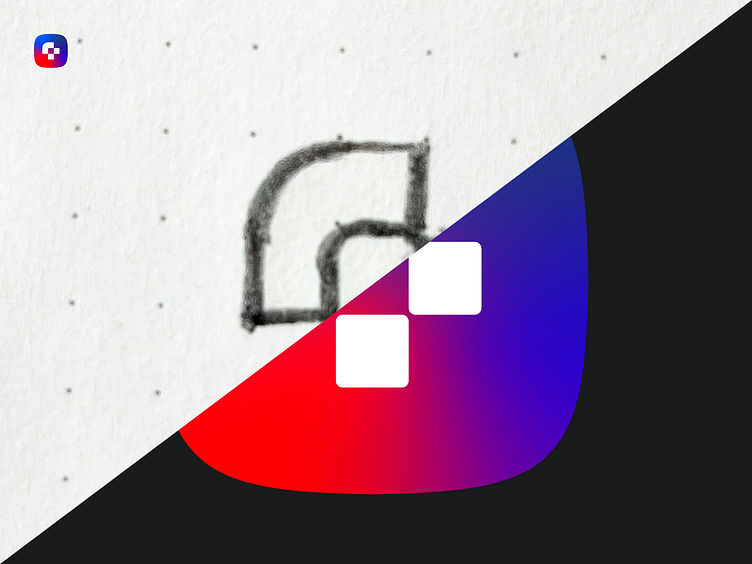
The Sketch
When I was done with the research I started sketching.
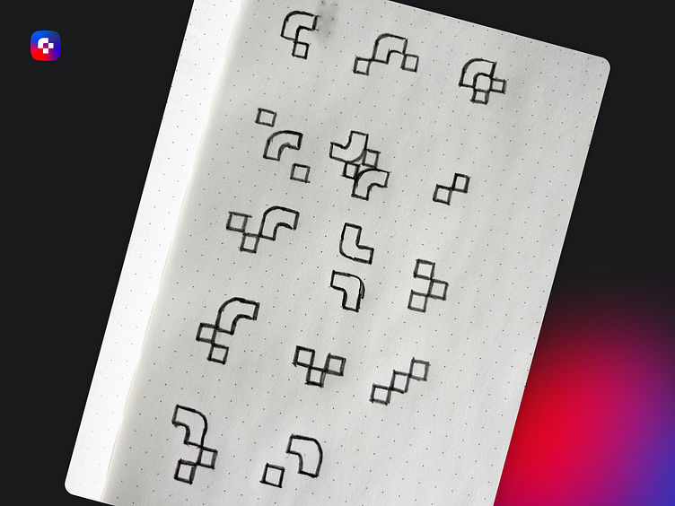
I started with the F. I broke it down and made multiple designs based on the first sketch.
One design stood out to me and I got to work immediately.
I worked out the sketches and chose the final one.
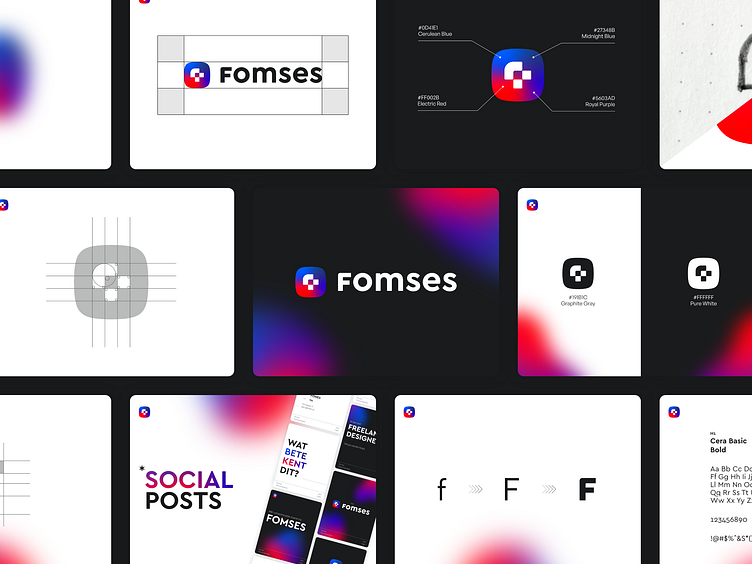
The Logo
After I explored a few color pallets. I chose one that stood out to me the most and aligned with my research.
Here is a breakdown of the icon
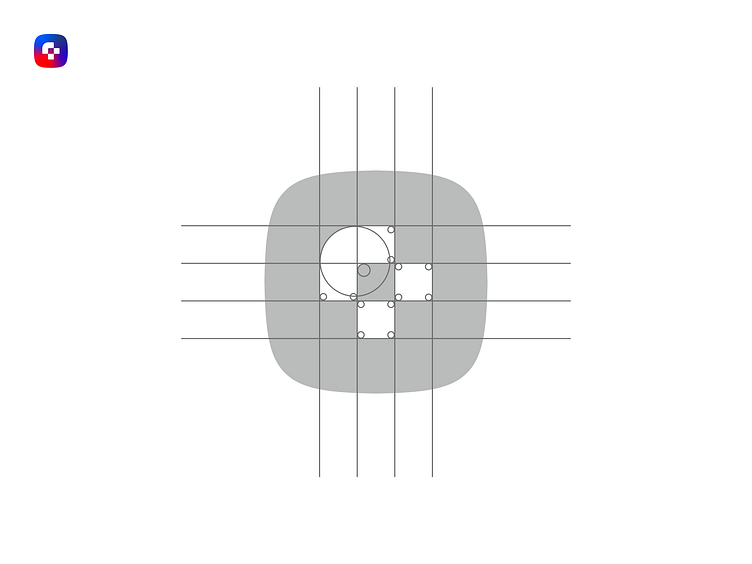
I rounded out the corners to give it more of a friendly look. I also used something called a squircle to give it a more open and playful feeling.
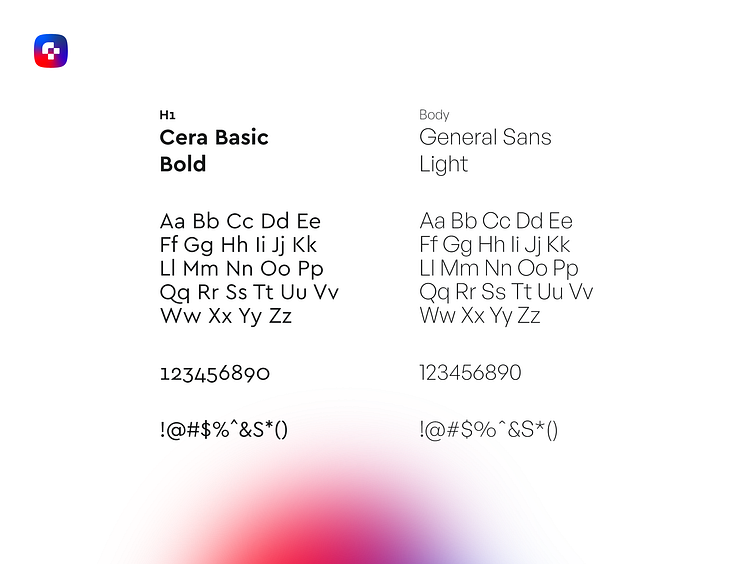
The Typography
I needed a font that worked well with the shape of the icon. The font I chose is
Cera Basic. The round shapes of the font work well with the shapes used in the icon.
To support the font, I used General Sans. it is a very basic font, but it gets the job done!
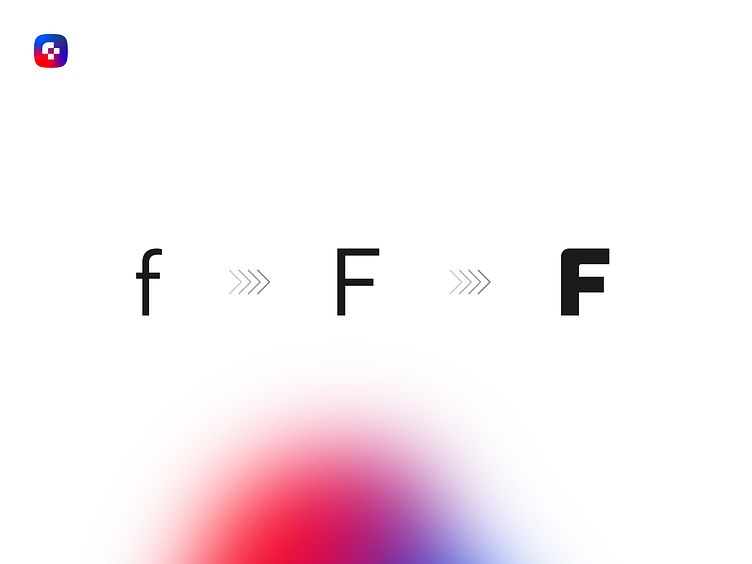
The only problem with the font is that the F has very sharp corners. I rounded out the corners of the F to change the feeling of the whole logo. It is a good edition the add to the logo.

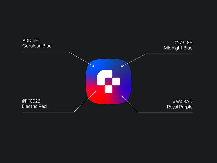
The Colors
The colors needed to be bold and prominent. After refreshing my knowledge on color theory I choose these colors to make a gradient that

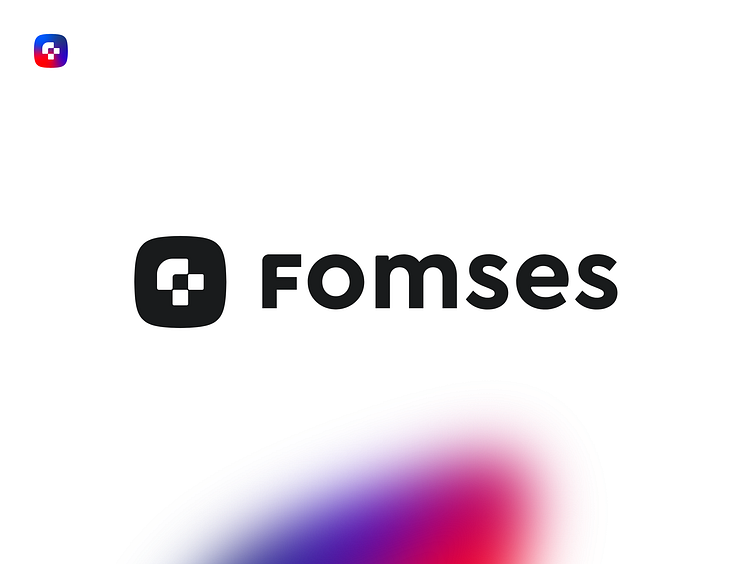
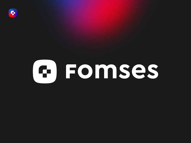
The Final Result
After I combined everything, the final result was staring right at me. Right as I changed the font and added the colors I knew I made something that visualizes my core values and mission.

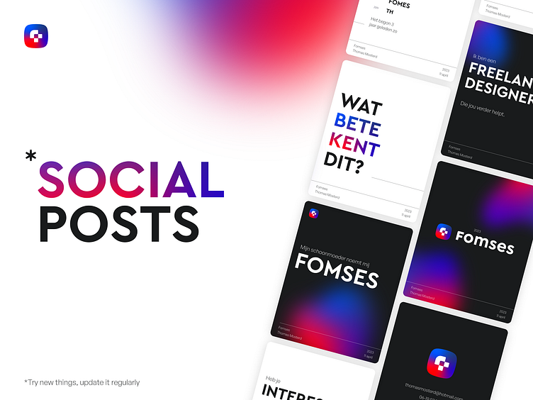
The Extra Elements
To expand my brand to other platforms I choose to make some extra expressions.
I used the gradient throughout out this post. It adds a modern feeling to the design.

For social media, I mainly focus on making carousels to better explain my story. This design is easily changeable and will grow with my brand to better express myself to users and potential customers.
It is important that I try new things and make sure to update it regularly.
Thank you for reading!
This case study was very fun to make and challenged me to create something that truly represents my brand!