Open Innovation Infographic Posters

When it comes to open innovation and open science infographics, it's important to consider the diverse audience that these concepts can attract. From industry professionals to academia and government, the messaging needs to be clear, concise, and easy to understand.
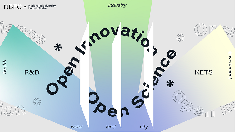
We utilized a range of visual representations to communicate complex ideas in a more accessible way.
One of the examples we used was an edgy and artsy design that still maintained a utilitarian aspect. This design was presented at conferences, used for posters, slides, pitch decks, and more.
Another one conveys the same idea in a more toned-down way.

Which one you'd choose, the 1st or the 2nd?
Press "L" if you like it and share your thoughts in the comments!
We provide ongoing visual communications support for overwhelmed founders and executives:
Data visualization (charts, tables, infographics illustrations).
Presentation design (investor pitches, corporate executive presentations, templating, and more).
Brand management and creative consulting.
Want to collaborate?
🌏 Visit: przntperfect.com
🤩 Behance: Prznt Perfect
Get free project estimation and consultation:
📩 E-mail: hello@przntperfect.com
👨🏻💻 Discovery call: Book a 30 mins call


