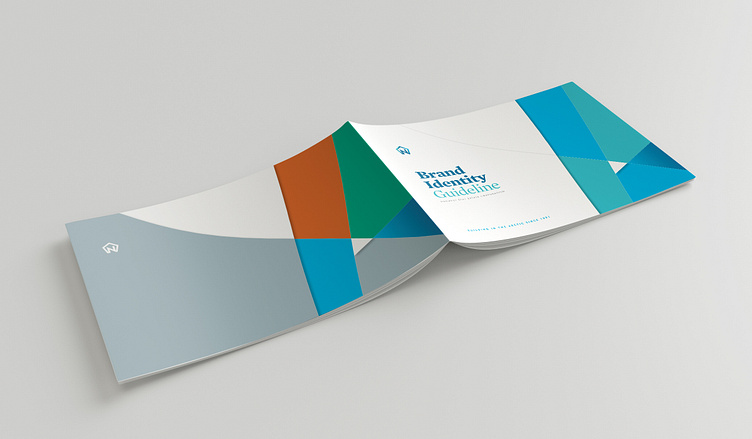
Nunavut Real Estate Brand Identity Guideline


Design of the Nunavut Real Estate Corporate Brand Identity Guideline
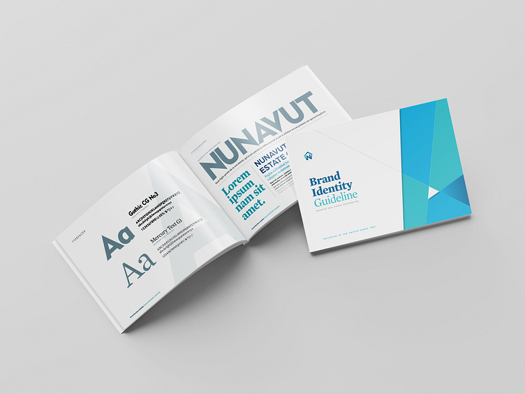
The client had an established logo in use and was looking for a guide that staff and/or creatives could reference. Building on the the visuals and the colours of the logo, and the Northern landscape of Nunavut, a simple yet visually dynamic brand identity was put together.
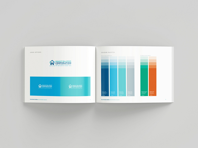
The primary colour palette provides varying hues of the arctic: blues, teal, blue-grey set against the bright white starkness of snow. Bright green and orange round out the secondary colour palette for contrast and as a nod to the warmer seasonal landscape.