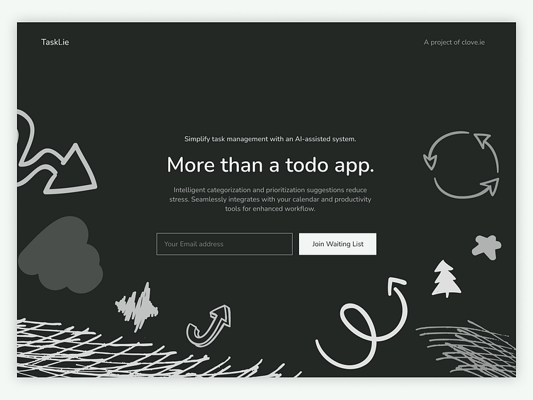
Todo app waiting list.
When I designed my waiting list single page website for a todo-app, I wanted to make sure it was user-friendly and easy to navigate. I kept the design clean and modern, matching the app's overall look and feel. The content was organized logically, so users could find what they needed quickly. I also made sure to include a big, bold call-to-action button to encourage people to sign up for the waiting list. The website was responsive and worked well on mobile devices. I added social proof, like customer reviews, to build trust with potential users. Overall, I was happy with how the website turned out, and it helped me get a lot of signups for my app.
More by Oskar Mroz View profile
Like


