Cloudplayer Album View

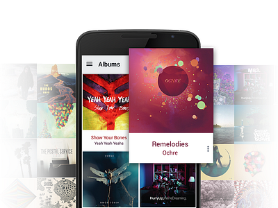
I helped doubleTwist with the design of their new app, CloudPlayer! The album view of CloudPlayer by doubleTwist uses a different approach to using dynamic colors pulled out of artwork.
Where many apps use an overwhelmingly strong color scheme in the UI background and main colors based off the dynamic colors, the album view pulls the colors out of the artwork to use as a typographical color flourish: the album and artist name both get their colors (within legible bounds) from the artwork, making for a beautiful, smooth album view.
More about CloudPlayer on the Pictogram website.
More shots on the design process soon.


