@Norm wow, thank ya! Plesantly to hear such warm words from you (:
You think it would be shorter? Or like a dot? I've tried to make it like a dot but i don't like the dot way (:
@Roberto Thank ya! It was practise, so I've used 72dpi. I've got little problems to resize in bigger size, especially with shadows, cuz they're rasterized and u've got to remake em.
12 Responses
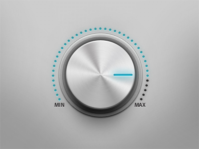
I was inspired by Norms latest shots so I've tride to make tasty sound control. Full size you can see here.
Also if you interested in how I made it you can watch
little screencast I've made.
almost 2 years ago
Like the touch of color.
Looks good
almost 2 years ago
@Rui yep, u re right I fixed up the first comment (: thank ya (:
almost 2 years ago
Love it!
almost 2 years ago
this is insane dude!!
question: ¿what resolution do you use for design Ui's? ¿do you have problems to resize later to a smaller size?
congrats! great job! and thanks for the screencast
almost 2 years ago
Nice, this looks great. Only bit I don't like is the length of the marker on the dial. Love the subtle shadow work :)
almost 2 years ago
@Norm wow, thank ya! Plesantly to hear such warm words from you (:
You think it would be shorter? Or like a dot? I've tried to make it like a dot but i don't like the dot way (:
@Roberto Thank ya! It was practise, so I've used 72dpi. I've got little problems to resize in bigger size, especially with shadows, cuz they're rasterized and u've got to remake em.
almost 2 years ago
Looks really good! :) dots are a bit blurry (and color is a bit dark, like it isn't emitting light)
almost 2 years ago
yeah the blue should be a bit lighter :)
almost 2 years ago
I'd say just make the inner blue dial marker shorter length ways. Keep it close to the outside edge.
almost 2 years ago
@Plexforms Yep, i know that problem and trying to fix it (:
almost 2 years ago
Amaizing, I'll watch the screencast right now.
about 1 year ago