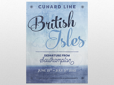
All aboard for the British Isles cruise!


Sorry it took me so long to put this live, but my last week has been strangely busy.
I'm happy to say that after a difficult labor process, I can present to you my latest @Design Cuts process piece: the British Isles cruise poster.
I’ll be showing you how to use the typefaces from the 15 Professional Quality, Hugely Versatile Font Families Collection to create a beautiful, type based cruise poster. We’ll cover some really interested Photoshop and Illustrator techniques, as well as general design principles. All aboard!
By the way: have a closer look at the end result in the attachments.
And I'd love to hear what you think of the tutorial, and/or its outcome: am I explaining things well? Are there things that could be done better/faster/differently? Did I screw up somewhere? Do you hate it? Do you like it?
Cheers!


