Analogous Mimeo

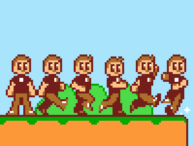
Further analysis of 8-bit sprites was required.
Findings: The aesthetically pleasing sprites from early NES platformers tended to feature analogous color schemes, shied away from absolute black outlines, and even though four colors were available artists limited their sprites to three (the most common fourth color being white).
Conclusions: An absolute black outline makes the sprite look as if it is sitting atop rather than inhabiting a level. An analogous color scheme makes it easier for the eye to track the sprite as a single unit, especially when animated.
Also, if Twitter drove the car that ran over my blog, Dribbble was the ambulance driver that stopped for a leisurely lunch (and maybe caught a movie) on the way to the hospital. DOA.


