NIMA brand identity

NIMA is a museum and cultural platform devoted to popularizing the art of peoples and countries across disciplines and time. To highlight NIMA and the important work they do as an emerging cultural institution, we created a striking identity that evokes diversity and multiculturalism.
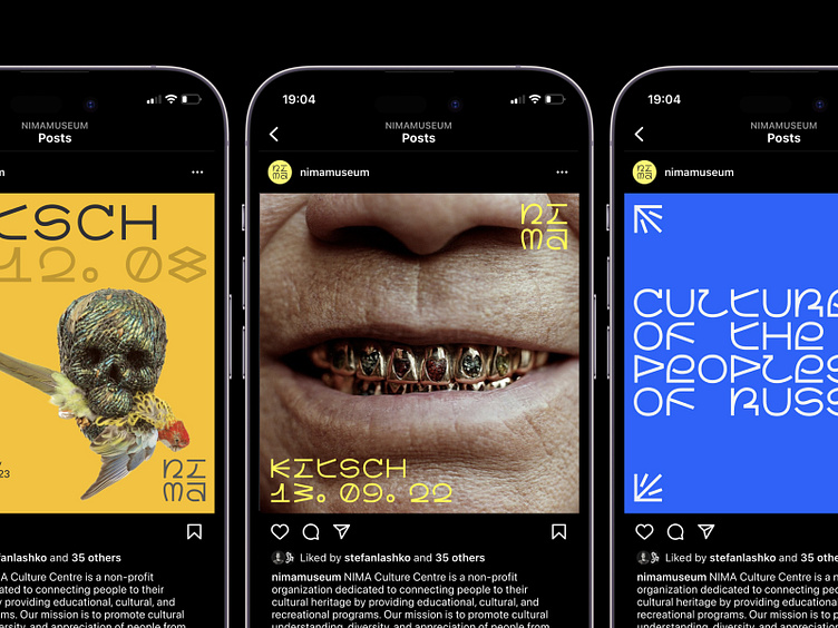
For NIMA's identity, we designed a custom typeface of the same name. NIMA’s projects focus on non-Eurocentric art, so we decided to base the characters on the world's writing systems, merging the west's Latin script, the north's runic alphabet, the east's hieroglyphs, and the south's Oceanic glyphs.
The NIMA font is so expressive, it becomes the primary graphic language for the museum. As a result, rather than creating a new logo, we chose to type it out using the NIMA font.
We decided to use a monospaced font in tandem with a grid: the characters are square, and all media layouts are built on a square grid. This rule prompted creative solutions to make even outline elements (in letters like Й, Ё, Д, Ц, Q) fit in.
| ESH gruppa | Instagram | Behance | LinkedIn | Twitter | Pinterest |


