Candy Sweet


Hello👋
Here is my new work.
Hope you like that, Thank you so much! 💜
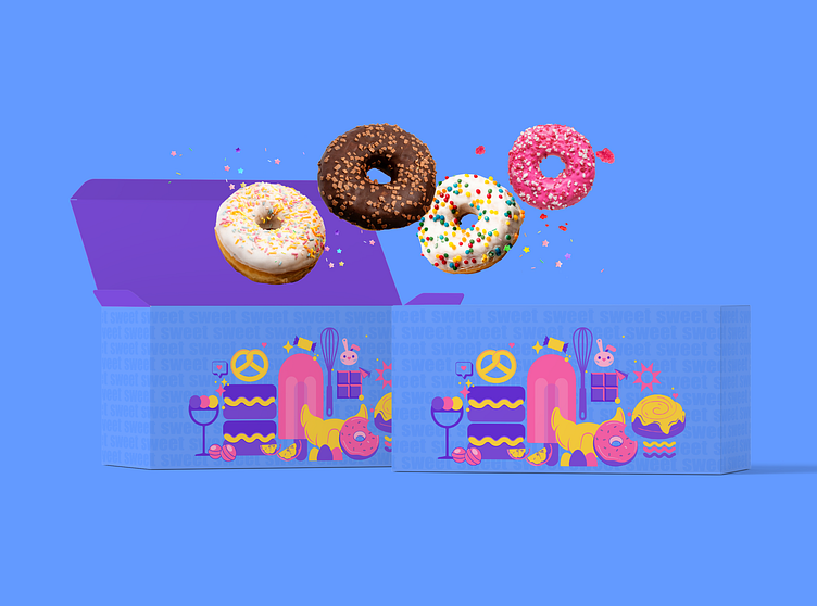
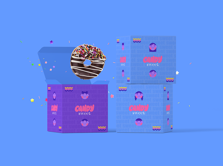
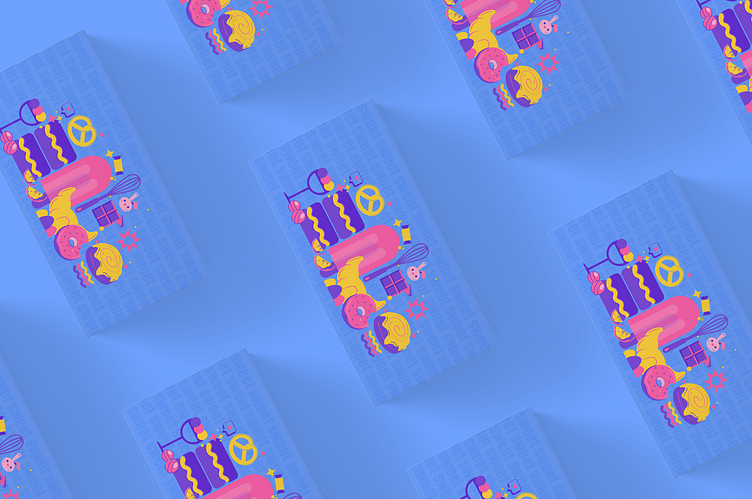
Overall, the illustration effectively communicates the brand's message of catering to a diverse range of customers and offering a wide variety of high-quality products. It's an excellent example of how well-designed illustration can enhance a brand's visual identity and help them stand out in a crowded marketplace.

The color palette used in the illustration is vibrant and eye-catching, which helps to draw attention to the different products. The use of shadows and highlights also adds depth and dimension to the overall design, making it more engaging and visually interesting.
The layout and composition of the illustration are well-organized, with each product placed strategically to create a balanced and harmonious composition.


Task: Branding for a confectionery store that has been producing unique sweets since 1995. The client's request was to combine naive simplicity with an aristocratic presentation for their brand identity. The logo and website must include the store's name and a quote.
Program: Illustrator, Photoshop, Figma, InDesign
You can see the full project on my page in BE
Do you want to turn your ideas into design?🔥


