Left Navigation

Hey Dribbblers!
Welcome to the design system's sidebar navigation! This navigation is designed to help you easily find and access all of the components, guidelines, and assets you need to create beautiful and consistent designs.

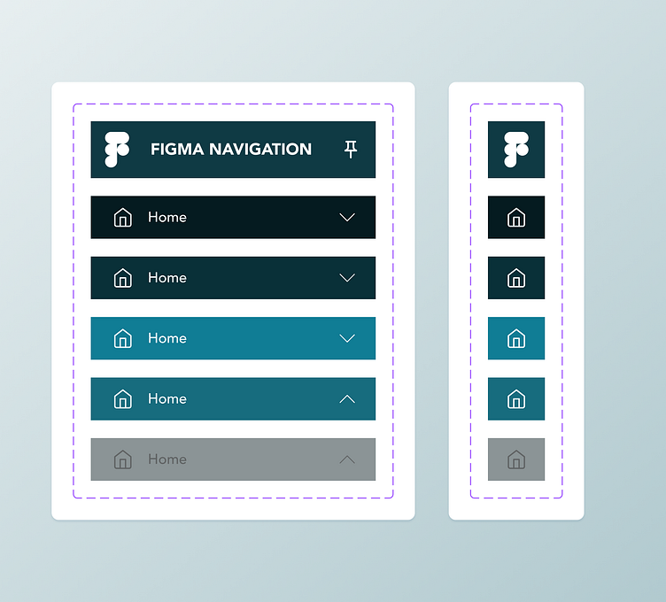
Interaction State
The interaction state of the left navigation is an important aspect of its design that can greatly impact the usability of an application. Interaction states refer to the different visual states that occur when a user interacts with the navigation, such as hovering over an item or selecting an item. By carefully considering the interaction states of the left navigation, designers can create a more intuitive and engaging user experience.
For example, when a user hovers over an item in the left navigation, it can change color or highlight to indicate that it is selectable. Similarly, when a user selects an item, it can remain highlighted or change to a different color to indicate the current state of the navigation. These interaction states should be consistent across all components of the design system to help users easily understand the application's functionality and navigate through it seamlessly.
It's also important to consider the accessibility of the interaction states for users with different abilities. Designers should ensure that the interaction states are clearly visible and easily distinguishable for users with color blindness or low vision.
UX Guide
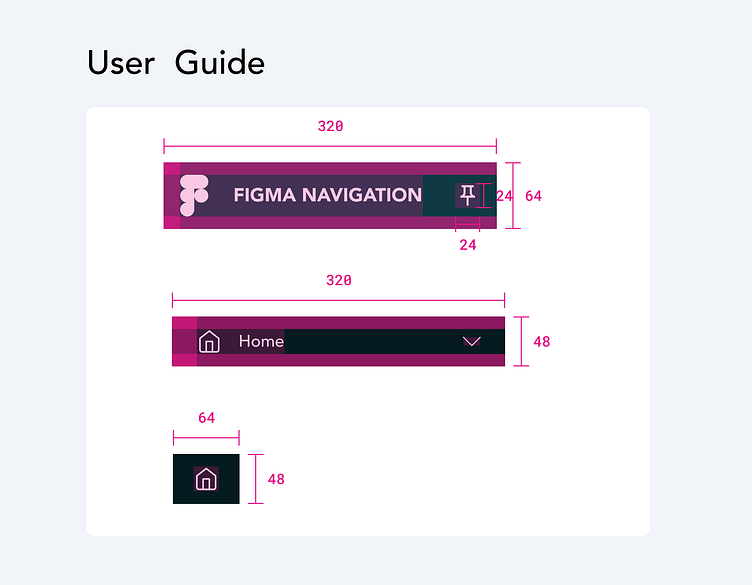
Defining the specs and dimensions for left navigation is crucial for ensuring consistency and usability across different applications and devices. Here are some important factors to consider when setting up left navigation specs in a design system:
Width: Left navigation width can vary based on the amount of content or the size of the device. A typical range for width can be between 200px to 320px, depending on the context of the design.
Font size and type: The font size and type of the navigation items should be easy to read and consistent across all states of the navigation. A font size between 14px to 16px is considered legible for most devices.
Padding and margins: It is important to maintain consistent padding and margins to help users easily differentiate between different navigation items and reduce visual clutter. A margin of 24px and a padding of 12px to 24px can be considered for most use cases.


