Artist Fundraising Dashboard
Hi everyone, would love to share a couple of screens of the dashboard that I've done.
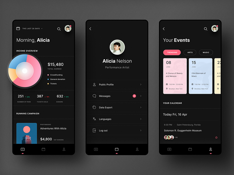
A cluttered dashboard can be overwhelming and challenging to navigate. Create an intuitive visual hierarchy by using font, size, color, and whitespace that guides users to the most important information first. Aside from that, adding labels, tooltips, and other elements can provide context and help users understand more about the context.
The goal of a dashboard is to provide users with the information they need to make decisions so keep things simple yet functional.
Thanks for watching! I hope you guys like it and any thoughts are welcome!
---
Check out my Instagram | Behance to see more if you like my work.