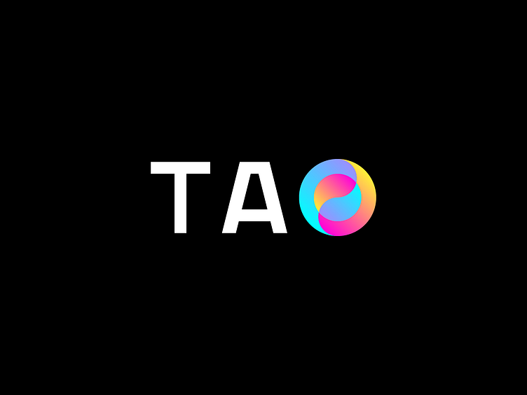
Logo for TAO

Whoosh, it was such a significant pause on my Dribbble account. Finally, I represent one of the previous logos I made on a freelance basis. Here you go!

A bit of details: This project in my portfolio showcases creating a logo for TAO, a company specializing in currency exchange. The main goal was to create a unique and memorable logo reflecting the essence of the company's activities and modern approach.
The graphic symbol, executed in gradients and incorporated into the letter O, represents the Yin Yang symbol. This sign conveys modernity and an innovative approach to the company, while the gradients give a sense of dynamism and movement, which corresponds to the company's activities. In addition, the simplistic design of the symbol makes it easy to remember and distinguish it from other logos.
The text part of the logo was created from scratch, providing it with uniqueness and individuality. In addition, the monochrome font is concise and readable at any size, making the emblem universal and applicable to various media.
The result of the work was a logo that reflects the essence of the activities of the TAO company, emphasizing its modern and innovative approach. The straightforward design and the skillful combination of the Yin Yang symbol and monochrome font give the logo uniqueness and allow it to stand out against competitors.
Let's work together!
Please feel free to reach out to me via DM on Dribbble or text me an email at stahy24@gmail.com


