Find designers
Designer search
Quickly find your next designer
Post a job
The #1 job board for design talent
Inspiration
Courses
UX Diploma
Learn UX design from scratch in 6 months
UI Certificate
12-week UI skill building for designers
Live interactive workshops
with design professionals
Jobs
Go Pro
Log in
Dribbble: the community for graphic design
Log in
Sign up
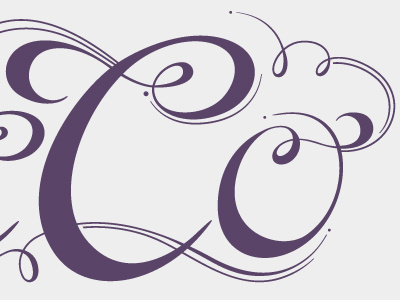
Co
Erica Burnett
Follow
Following
Like
#EEEDEE
#5B4569
#C1B9C4
#A499AB
#7B6B86
Download color palette
I'm working on a monogram for a friend's wedding. It's harder to make two C's and an O interesting.
custom
hand drawn
lettering
logotype
View all tags
Posted on Jul 10, 2011
1,000
1
36
12
View feedback
Erica Burnett
Welcome to my design portfolio on Dribbble
More by Erica Burnett
View profile
Previous
Next
Loading…