Browser Chrome in Context

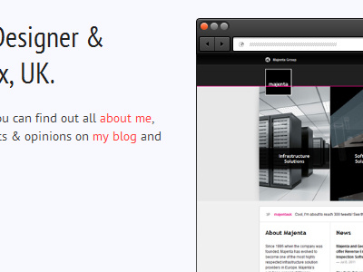
Here is the browser chrome in context. I've made the buttons a bit lighter to define them a bit more. It's also going to be responsive/fluid, using the sliding doors technique.
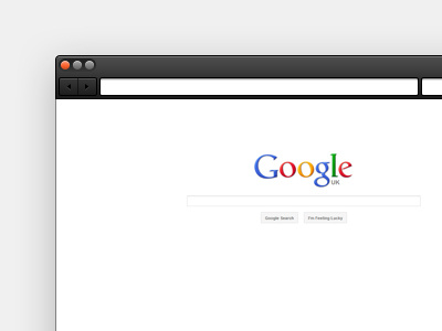
Here is the browser chrome in context. I've made the buttons a bit lighter to define them a bit more. It's also going to be responsive/fluid, using the sliding doors technique.


