Branding, web design, visual identity | La Lune Le Soleil


Who is La Lune Le Soleil?
La Lune Le Soleil is a fashion accessories brand that seeks to bring a splash of color into the lives of its customers.
With Patricia's goal of creating a brand that embodies an elegant yet casual lifestyle - with a touch of fun, the project was 360º.
The purpose of the project was to create a brand from the ground up. From the brand's positioning, naming and visual identity to web design, packaging, collaterals and social media graphics.

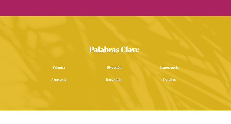
Territory
' Carry with you the colors of the world '
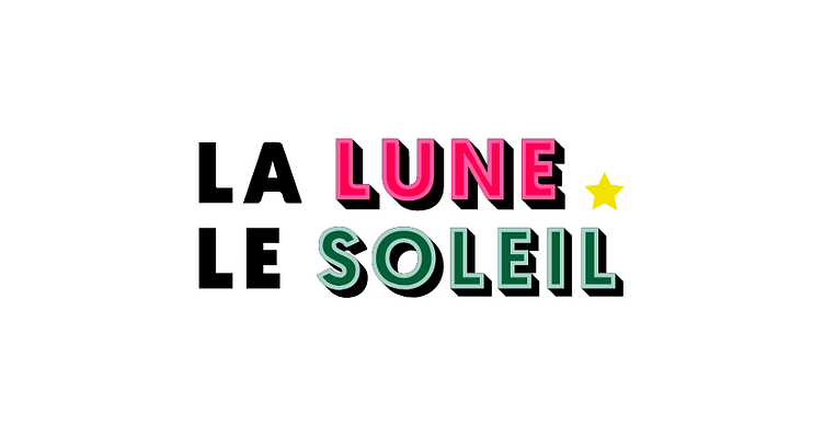
Naming
The naming exercise was long and after several brainstorming sessions and iterations, we arrived at La Lune Le Soleil.
The name had to contain in its essence the ideas of femininity and contrast, two basic pillars for the brand.
In addition, it had to reinforce the idea of its Mediterranean origin, evoking the romanticism of France and its Haute Couture.
Concept
To develop the brand concept, the starting point was the carefree French cinema and the colorful images of the 60's and 70's. Love, freedom and feminity were the driving forces of those years.
Their music plays in the workshops.
The color was the key element.
The desire to enjoy - without thinking too much, wherever you are in the world.

Visual identity
The brand image had to summarize all of the above and embody the style of a modern woman who breaks with artifice and traditionalism.
We decided to focus on a bold graphism with a lot of contrast, but still modern while being inspired by retro in order to attract attention, but letting the product and the brand's story be the real protagonists.


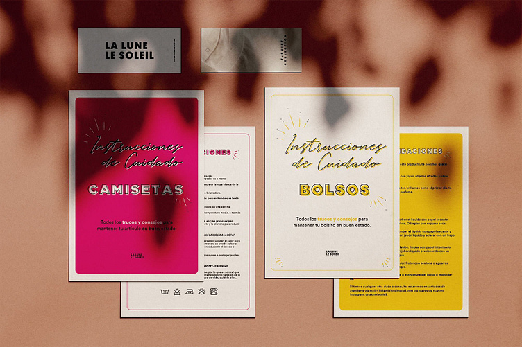
Touchpoints
Design of the different applications of the brand's visuals.
+ Fabric tags
+ Hangtags
+ Flyers
+ Keychain initials in acrylic


Are you looking to hire a graphic designer? Contact me - hola@catalinalopez.es
The Website
The website design had to feel spacious, clean and modern - like an art gallery.
The effect was achieved with friendly menus and text, simple and easy on the eye, with plenty of negative space.
The spotlight is given to graphics and product photography.
80% of the brand's traffic comes from mobile devices, so making the website responsive was a must.
The home page banners were designed with exclusive versions for smartphones.

Social Media Plan
Focused in the tone of communication, the main objective for the first months was to create brand awareness and to connect with the audience.
The tone had to be light, informal and easy going in order to complement the bold graphic style and to relax the more serious product photographs shared.

Let's create something great together. Contact me - hola@catalinalopez.es


