Purely Pacific - Beer Label Design

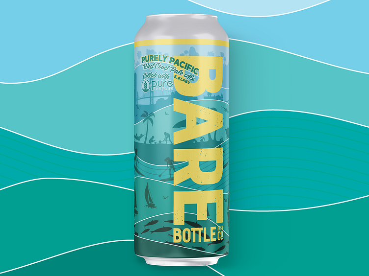
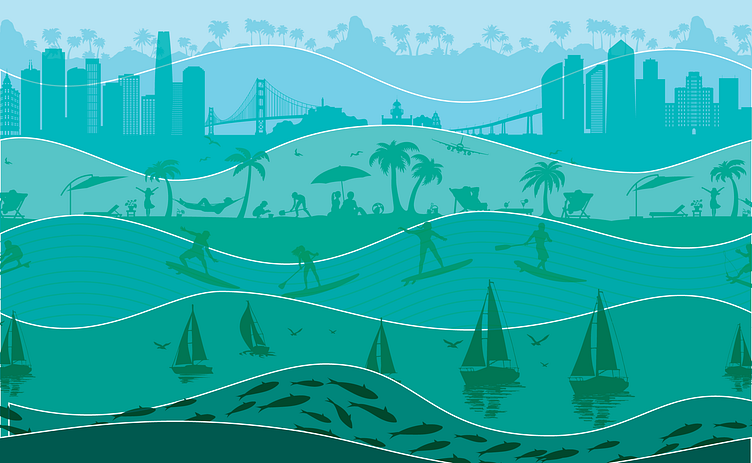
How do you capture the essence of California Collaboration between two breweries united by the mighty Pacific? It is a purely graphic exercise in visualizing the flavor of the beer inside. Translated out of design speak, I hit upon the idea of using a subtle green color palette to capture the flavor. The undulating waves of color provided a layered approach. Each wave moves to reveal a snippet of the design. I imagined a view as if you were far off shore looking towards land. Fish jump near you, a sailboat slices through the water. Near the shore people surf the waves & play on the beach. In the distance the palm trees wave in the wind.
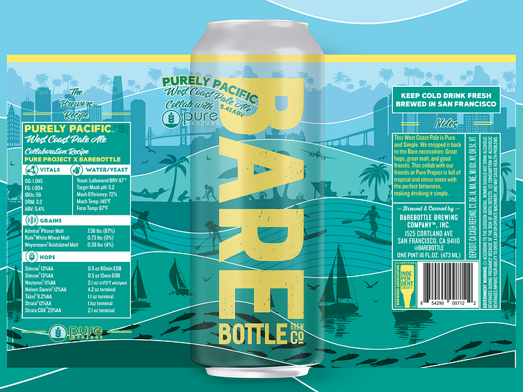

Deconstructed