WCAG-Compliant Color Palette Redesign

Concerned about the poor accessibility of Amber Engine's website and other materials, I decided to pitch the idea of a WCAG-compliant color palette redesign. Even though Amber Engine was not actively seeking a redesign, they were open to the idea and interested in hearing more.
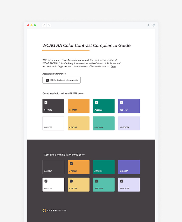
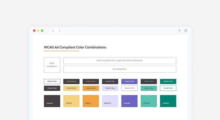
Using the latest Web Content Accessibility Guidelines (WCAG), I conducted research to identify colors that would meet the contrast requirements. From there, I created a range of color options that would complement the brand's existing visual identity. After presenting the options, we collaborated to choose a final color palette.
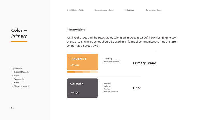
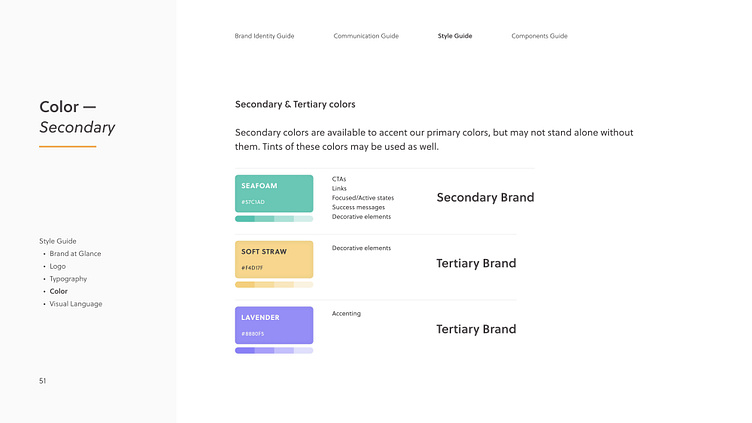
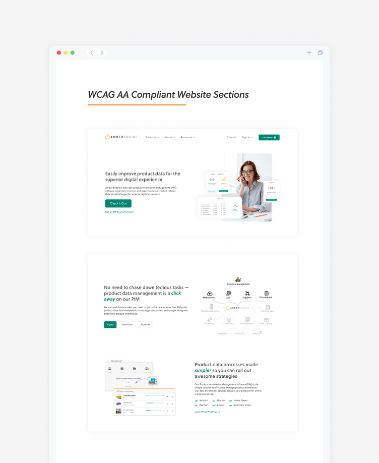
The new color palette features two shades for each of the branding colors, including primary colors of orange and yellow, secondary color of green, and tertiary color of purple. These shades work well with both light and dark backgrounds. To ensure consistency in using the new color palette, I created a guidance file that features possible color combinations and usage guidelines.
With the new color palette, Amber Engine's digital presence is now accessible to all users, including those with visual impairments. The redesign also maintains the brand's visual identity and helps to build brand recognition across various digital platforms.
Old color palette