Remodel Moore Rebrand + Website

Brand Identity
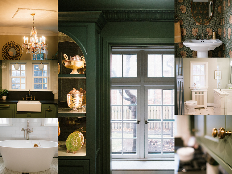
Remodel Moore does incredible work. To say that they are a remodeling company would be a big understatement. They - quite literally - are helping dreams come to life.
This is a company that is passionate about restoring history in Kansas City, spending a large portion of their time doing projects in homes that are over 100 years old - and the smallest historic details matter.
It was a joy working with the Remodel Moore crew on their rebrand. The deep intentionality and care they put into their work was an inspiration to me as I worked through the brand identity.
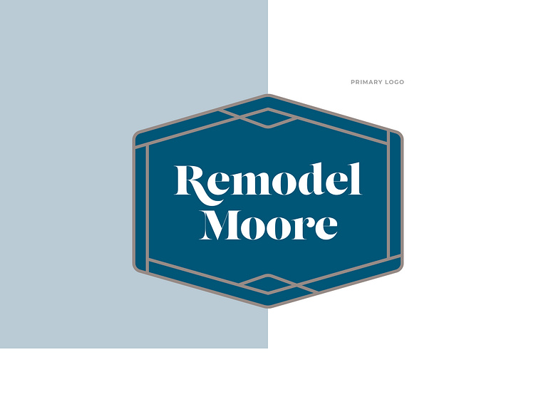
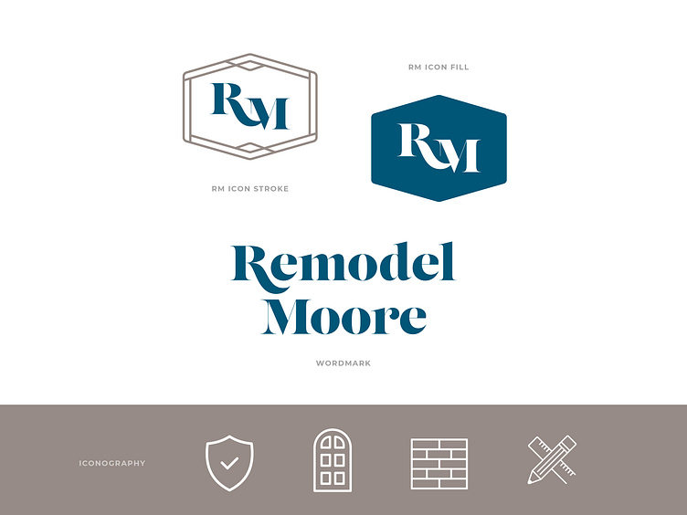
Their old logo lived inside of a shape and had a stencil feel to the font. My desire for their new brand was to mimic what they do on a daily basis—which is breathing new life into something that was once full of character and charm. Preserving the small "historical" details of their brand was important to me as a way to honor their rich tradition.
I slightly modified and updated the shape and added a unique border element that speaks to the high-end craftsmanship aspect of their business. The logo symbolizes sophistication, precision, and attention to detail.
The brand font (Lust) has a stencil element to it—with extreme contrast in the stroke widths—while still being classy and modern at the same time. This made it the perfect font to pay homage to their beginnings as the next iteration of their brand identity.

Website
This brand needed an online home with space to breathe. It needed room to allow the quality of their work to shine through every single page. That was the ultimate goal in designing this website. Stripped down of unnecessary language and packed full of the valuable information and driven by the visual aesthetics.