Groopt + Pulse Redesign

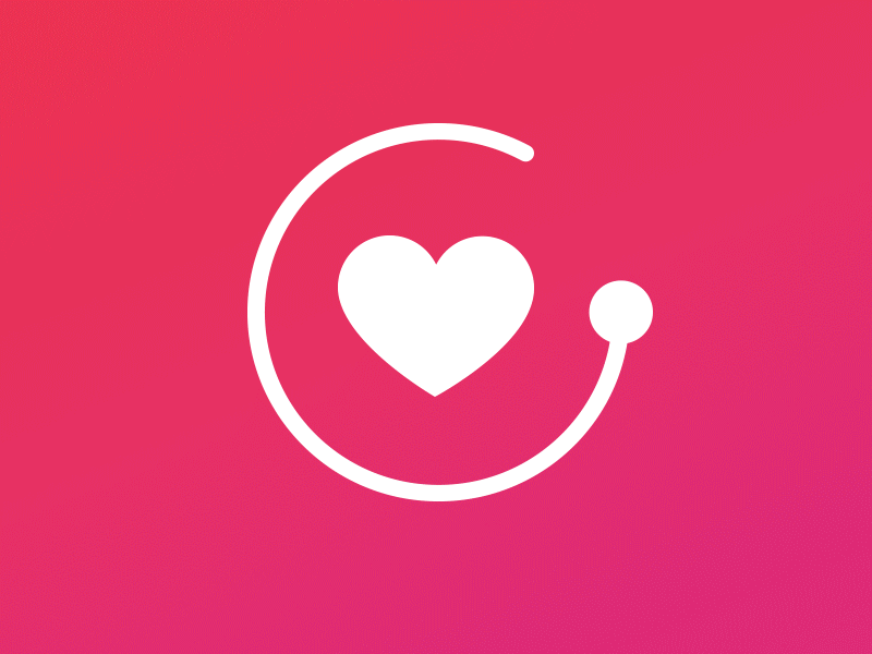
Groopt soon realized that their database was the root of their client's needs. So like most startups they pivoted. They now started targeting the non profit space. I needed to take their heart icon from the pulse branding and make an icon that played into their uinque, humanistic typeface. This icon screams security and database with it's power button resemblance and hard edges.


