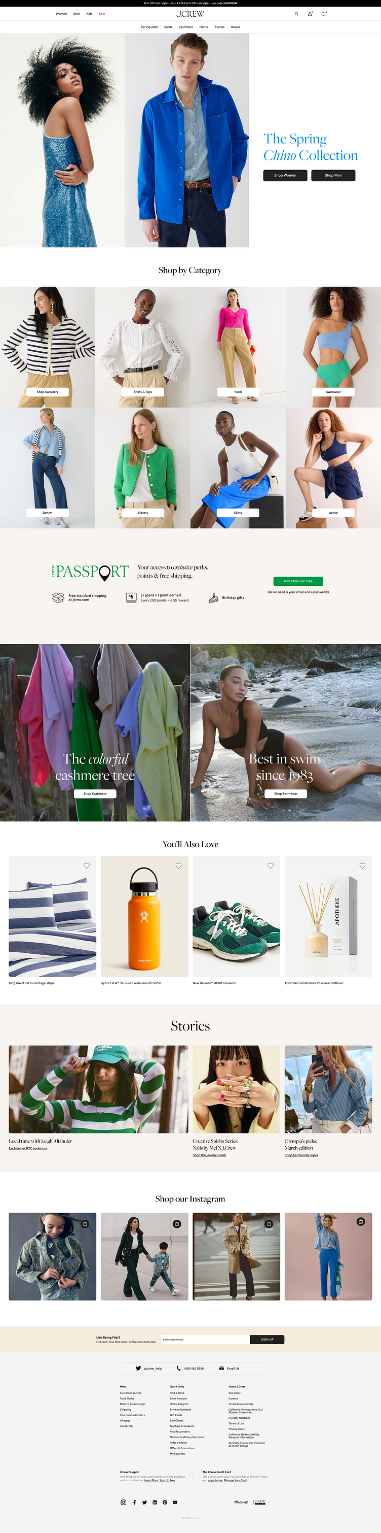
J.Crew Landing Page Concept

I was recently on the J.Crew website and I found the landing page to be very overwhelming with all the sales micro copy and thumbnail like images. I thought it could be elevated a little. This is my take on their landing page. J.Crew is not a super high end store but the customer can feel that they are, while shopping on the site. To guide the design, I went the route with a user persona that:
cares about high-quality items but can't afford the luxury brands
pays attention to small details
makes Pinterest boards of the styles they like
fantasizes about one day being able to afford all of these luxury brands
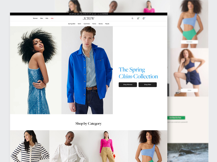
The solution: a site that is clean, bold with large imagery. The use of larger images gives the customer more insight to the quality and style of the clothing. With limiting distractors other than CTAs, the customer main focus is on the products.