Haaven - Property - Branding


The company name "Haaven" is inspired by heaven, which means a beautiful and happy place.
The company focuses on the real estate and property industry. So the client made it clear that they wanted a hands-on approach to their branding – to be seen as a very modern-looking brand to be sold in major cities nationwide. Therefore, the solution is to develop a clear and consistent brand strategy, including a logo, slogan, and brand values, reflecting the image that must exude modernity, comfort, and assertiveness.
See below our process of designing a visual identity that can help differentiate a brand from the competition and build customer loyalty.
Scroll to see full version case study! 👇

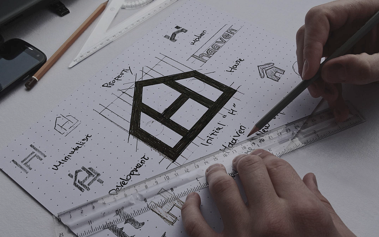
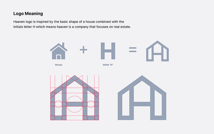
Logo Concept
Here's the concept of our design project. Check it out!


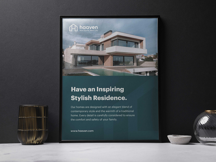
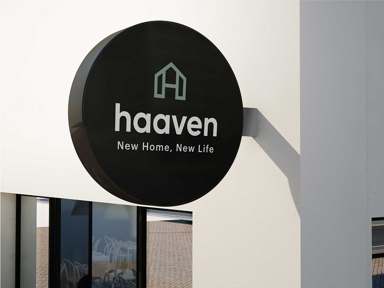
Outdoor Ads
Here's the outdoor ads preview of our design project. Check it out!

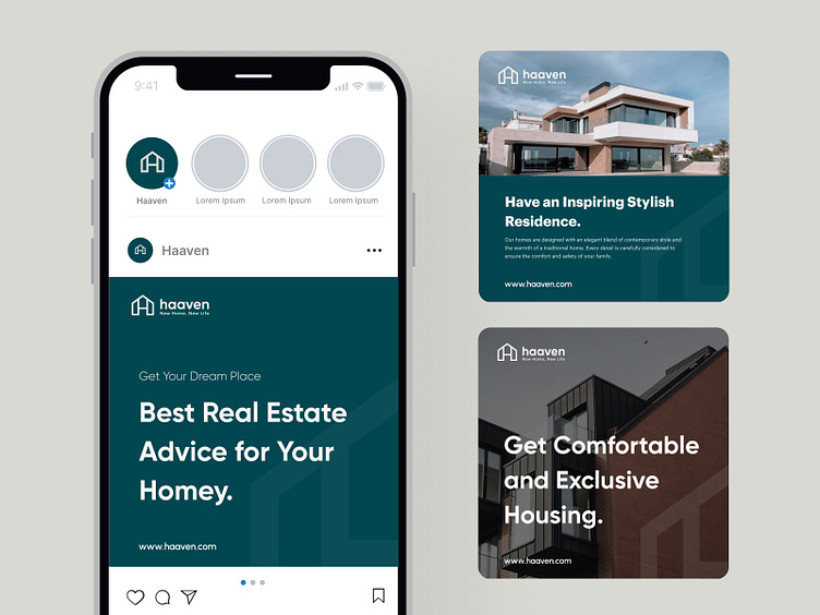
Social Media Ads
Here's the social media ads of our design project. Check it out!

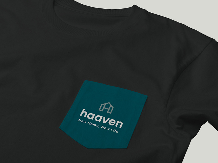
Brand attributes
Here's the brand attributes preview of our design project. Check it out!


Style Guide
Here's the style guide of our design project. Check it out!

Thank you, Interesting to collaborate? 🤝
We're ready to solve your problems and collaborate with your product. Let us know and say hello at hello@dipainhouse.com
Dipa Inhouse is a creative digital design and development agency. We provide high-quality services and help you to find solutions in UI/UX designs that are intuitive and represent your business goal.
Website • Instagram • Clutch • Contact Us


