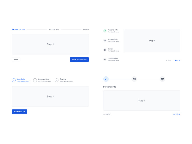
Stepper component

Hello designers 👋
Today we're sharing with you another component from the Flowbite Design System: a stepper component.
The stepper component can be used to show a numbered list of steps next to a form component to indicate the progress and number of steps that are required to complete and submit the form data.
It's designed to save time by addressing popular inquiries upfront, and often covers topics ranging from basic to complex.
What is Flowbite?
Flowbite is an ecosystem of open-source libraries, tools, and products built around Tailwind CSS consisting of a Figma design system, component library, website section, and page templates, and other tools.
📚 Flowbite Library - Open-source components built with Tailwind CSS
🎨 Flowbite Figma - Design system built for Figma
🧱 Flowbite Blocks - Building sections for website and applications
💎 Flowbite Pro - A larger collection of the open-source version of the latter three
👩🎨 Figma Community - Get the free version of the design system
You can learn more about Flowbite in this video by Adrian Twarog.


