Propology - Logo Concept v3

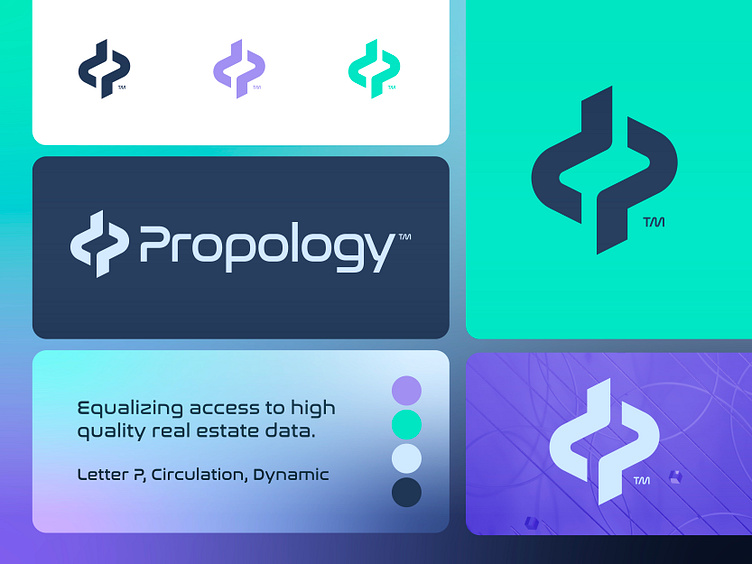
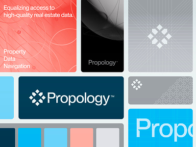
Propology is equalizing access to high-quality real estate data.
After careful consideration, I have decided to take a new approach to our logo design, aiming to create a more dynamic and less abstract look and feel. While our previous concept was effective, it lacked the dynamic energy that truly represents the values of Propology.
To achieve this goal, I have chosen a more fluid typeface and created a complementary symbol to complete the design. By maintaining equal curvatures throughout, the mark appears clean and balanced to my eyes. However, I am always open to hearing feedback and any concerns others may have.
Have a great day everyone!
Jeroen
___________________________________________________________________________________
___________________________________________________________________________________
Let's work together and elevate your brand!
Feel free to reach out via Dribbble DM or E-mail:
👉 info@jeroenvaneerden.nl
💼 Connect with me on LinkedIn / Read my Client Recommendations
🎬 Check my YouTube for Logo Tutorials / Learn Logo Design
🔗 Follow me on Instagram / See BTS and New Content
💬 Tweet with me