HBC Website Redesign

The Brief
Hickory Bible Church is a non-denominational church with a few hundred members based in western North Carolina. HBC's website was suffering from lack of user focus, poor information architecture, and awkward user flows. My goals were to make the web experience much friendlier to guests, make it more usable for members, and update the UI and visuals.
• Applied practical research to reach actionable insights.
• Updated the information architecture based on research findings.
• Streamlined user flows focused on key user tasks.
• Updated UI and visual language to be more in line with brand voice.
The Starting Point
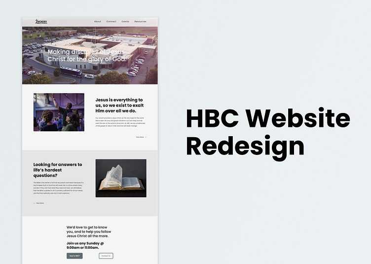
Here's where we started: rather dark and rather stark to be honest. One big problem was that the website was structured more like the organizational architecture. It made sense for the staff, but wasn't helpful for church members, let alone guests.
The Research
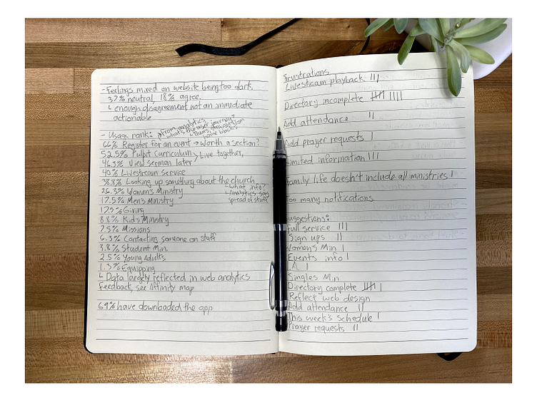
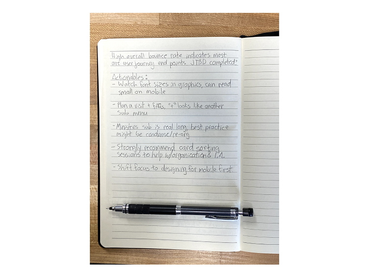
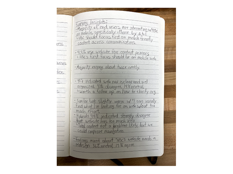
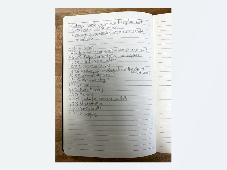
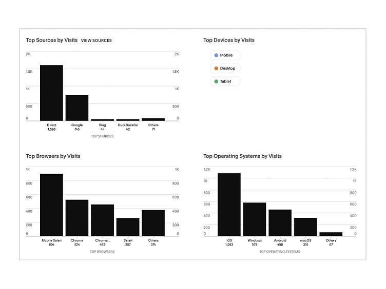
I knew from user feedback that we had some usability issues and devised a research plan to help discover actionable insights.
• Fielded user survey for broad data collection (available here).
• Conducted user interviews with questions based on user feedback and survey data.
• Compared the qualitative data against analytics data to support hypothesis.
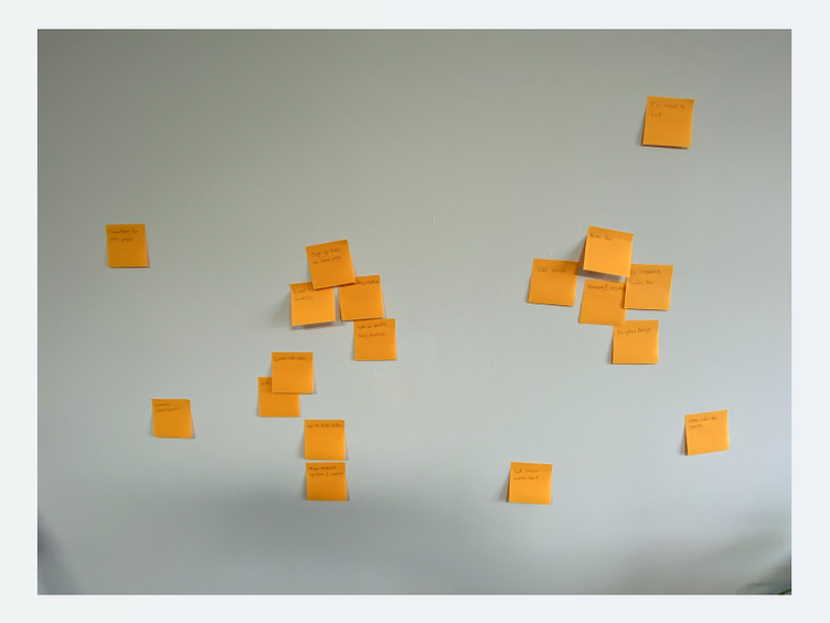
• Affinity mapped insights gleaned into actionable steps.
Process
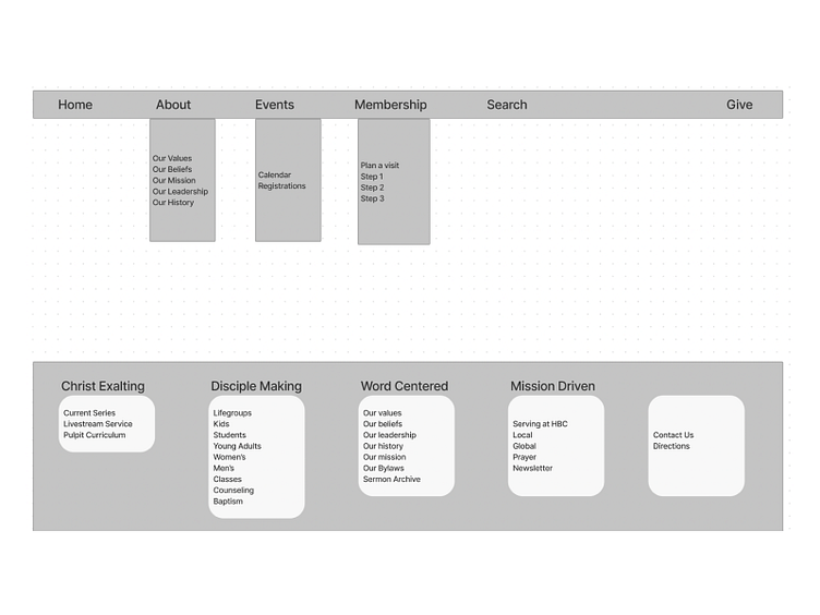
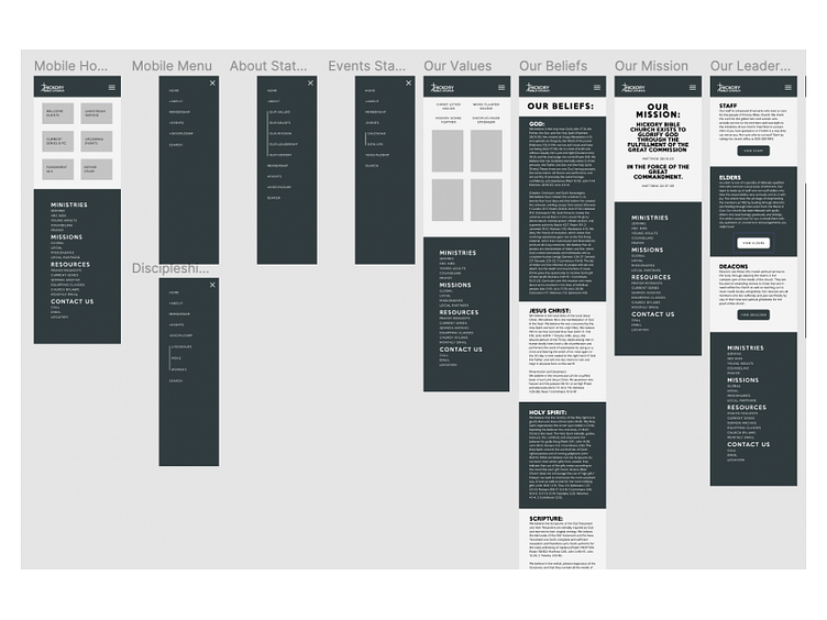
Armed with my research insights, I started mapping key user flows and laying out some basic wireframes.
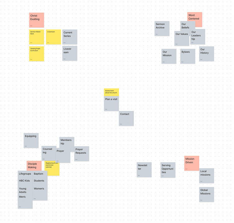
• Mapped key user journeys with emphasis on priority tasks.
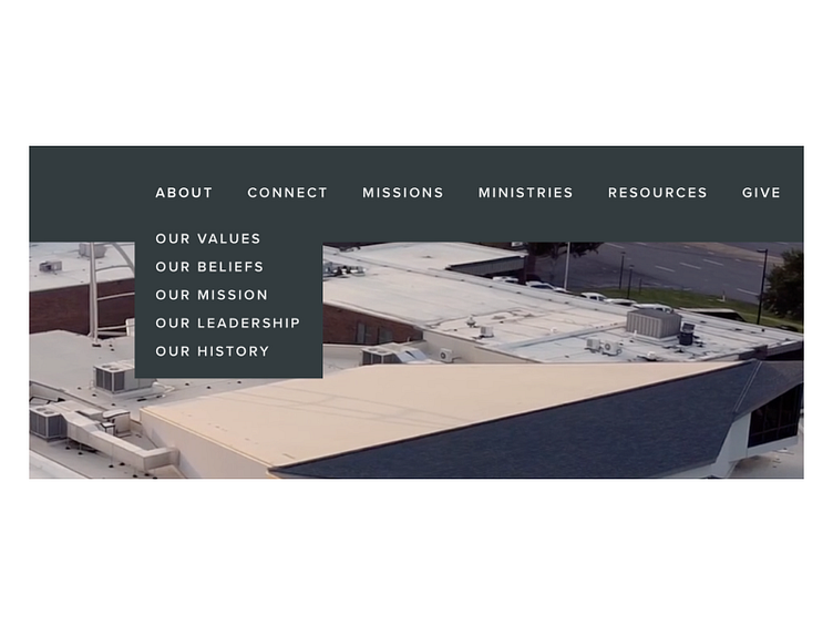
• Simplified main navigation architecture focusing on key user tasks.
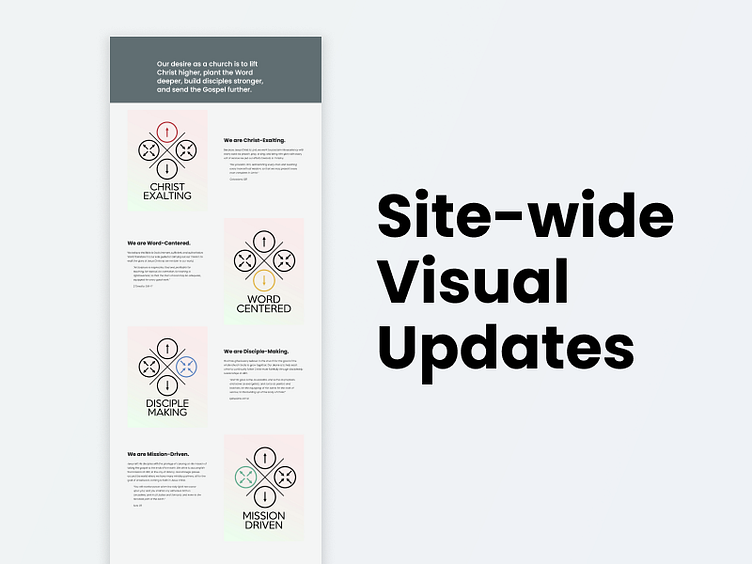
• Reorganized important but rarely used content into four main categories reflecting the church mission statement and guiding values.
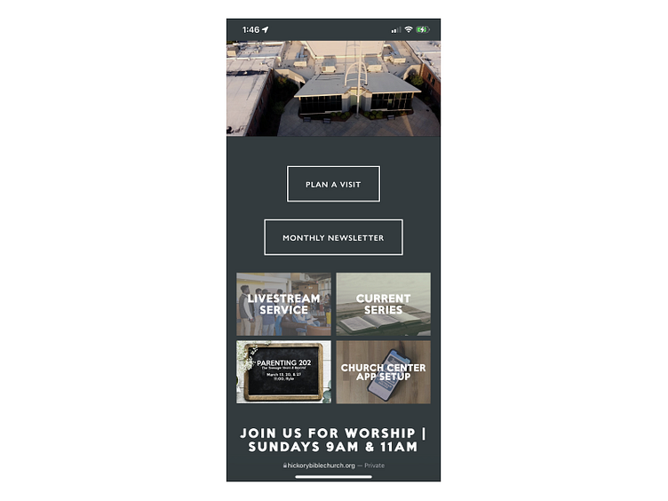
• Built mobile-first prototype in Figma to test with users.
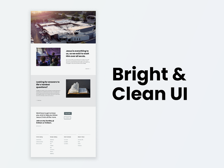
Solutions
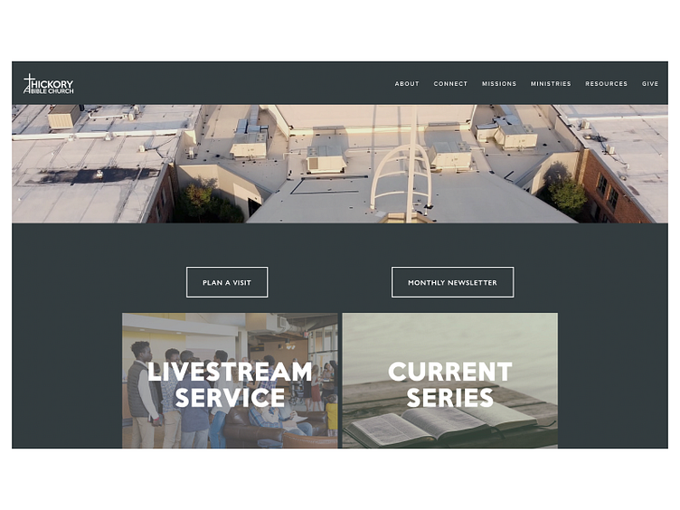
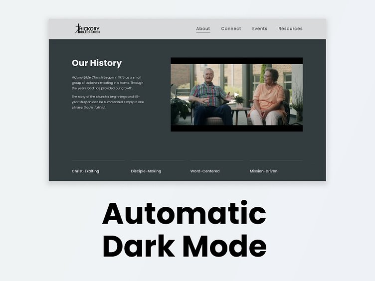
I spent a good bit of energy updating the visuals of the new website while staying true to HBC's established brand guidelines.
• Updated visual & UI design with friendlier appearance while staying true to brand guidelines.
• Applied updated IA for more intuitive guest navigation.
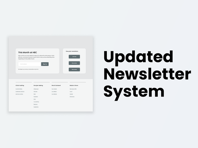
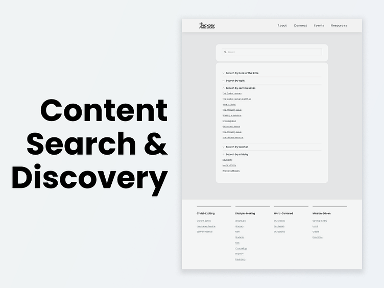
• Applied new search and discovery tools leveraging CMS.
Results
This is an ongoing project, so I'm gleaning a small insight here and making a small UI tweak there. One note with designing for a church is that KPIs are inherently ephemeral and difficult to quantify. That being said, the qualitative feedback from this project has been quite positive.
• Significant reduction in support time from users unable to complete tasks, saving time and resources.
• Multiple stories of guests finding us online and streaming before coming in person, indicating discoverability and usability.
• Consistently positive feedback on the new visual direction.
Find me on LinkedIn


