To the MOON! - NFT Marketplace
It’s time!
I have always looked up to the great work here on dribbble shared by designers from all over around the world, each in their respective discipline. So, it’s about time I start creating some dribbble-grade design myself.
What could’ve been a better to do that other than taking The Dribbble UI Design course by Daniele Buffa. And here I’m publishing the outcome of a 4-week journey of exploration. The learning by doing with live mentorship (Thanks to @kristi-digital) has been a rewarding experience!
Moon NFT Marketplace
Throughout the course we were supposed to design few screens for a hypothetical client looking to create an NFT marketplace to revolutionize the artists community.
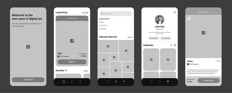
Since the course is focused on UI design, the UX part is figured out and the wireframes are provided before hand .
My mission then is to establish a visual language of this new NFT marketplace app, lock a visual aesthetic and then scale the design on multiple screens, based on the wireframes and the flow that is provided from the client. Build a UI Library of the final UI and create a functional prototype (optional).
Setting the mood
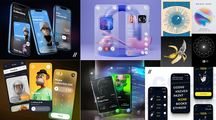
Having done a very simple research I stumbled upon some interesting design approaches then I put together this mood-board to guide my exploration
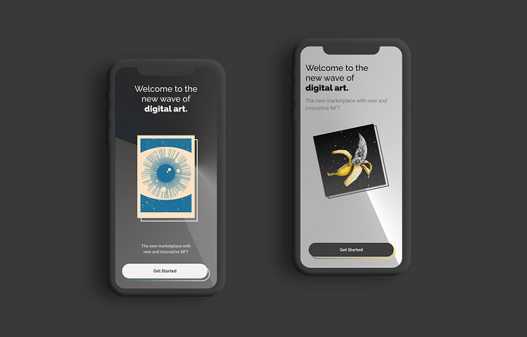
Designs that used the element of translucency to create some kind glass-like effect caught my attention the most and I really wanted to experiment with that to allow NFT artwork to interact with the user interface.
Before I do so, I had to design a quick logo for the marketplace just to get it out of my system as a brand design then focus entirely on the user interface.
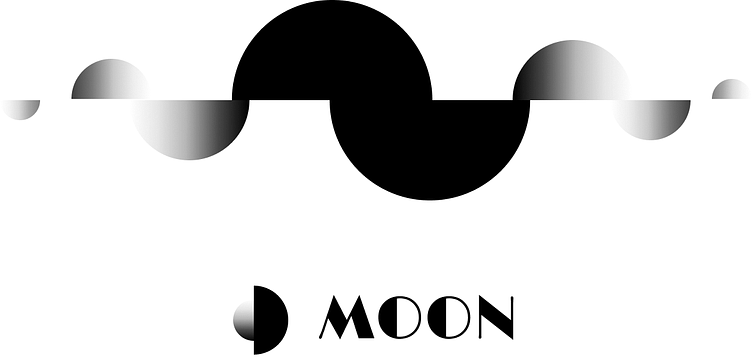
I came up with a simple concept based on the moon phases, which ended up influencing the user interface in a good way.
Visual exploration
The moon phase concept ended up influencing the user interface a lot in my first approach, in a good way though. I also experimented with simpler approach using some candy pestle colors that didn’t really grew up on me.
But hey, that’s why we explore with different approaches in the first place.
This first direction was a clear winner for me, not that it just looks very interesting, but rather challenging when it comes to scalling it to other screens and elements of the interface. After putting some efforts the first results was promising and seems to be working, although it still needs a lot of work.
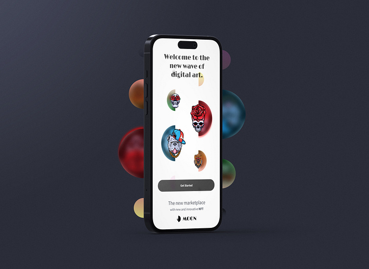
Final Screens
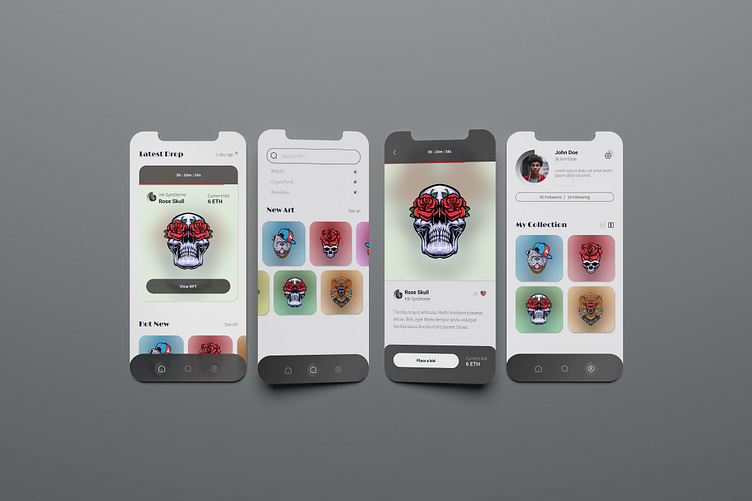
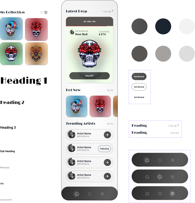
After a couple rounds of iterations I managed somehow to polish the design and scale it to the rest of the screens, it’s very important at this stage to focus on building all the design components in a way that allows them to be reused and repurposed for different contexts and states throughout the user, it also makes collaborating with other designer and designing a large volume of screens more effiecent. It also gives great control over the typography structure and color system when it comes to making final refinements at a scale.
Finally!
This journey was about embracing the basics once again, and acquiring a methodology to build design on a robust foundation. Starting from getting a guided inspiration from other designers’ work, to really putting the effort to iterate and refine the design to the very pixel. This might change the way I approach my design process forever to the better.


