Communication - One of the most crucial components when building trust between two parties.
Working for a Residential Home builder, we would frequently hear clients express a desire for more comprehensive updates throughout their journey.
The solution was an app and ecosystem that leveraged existing systems to offer clients enhanced communication and data.
In this case study, I dive deeper into my design decisions and considerations. To make it simpler, I've categorised them into three main modules of this project:
Real-time communication, Build Progress and Documents & Media.

The Solution
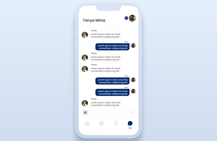
Conventionally, clients and staff communicate over the phone and through emails. These methods, while seemingly effective, seem to end with information being lost and misinterpreted. The purpose of this module was to:
• Centralise all communication.
• Removing the need for emails.
• Transcribe phone calls.
• Enable transparent communication.
The Design
The goal was never to try and re-invent the messaging experience. Instead, I leveraged the assumptions most users make when using a messaging platform (iMessage, Messenger, Signal).
Having clients with different backgrounds, ages and technical abilities meant that the design needed to be accessible and easily digestible.
This design aimed to be un-cluttered with an emphasis on the messages and the person that the client is chatting with.
Much like the rest of the app, it features a very monochromatic palette with a single accent colour and an accompanying variation with 50% opacity.
The page is simple in its functionality. It features an area to type/send messages and attach accompanying documents, photos and videos.

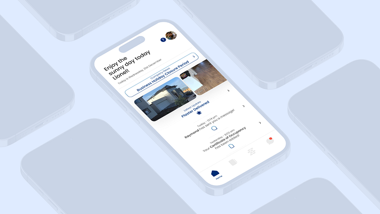
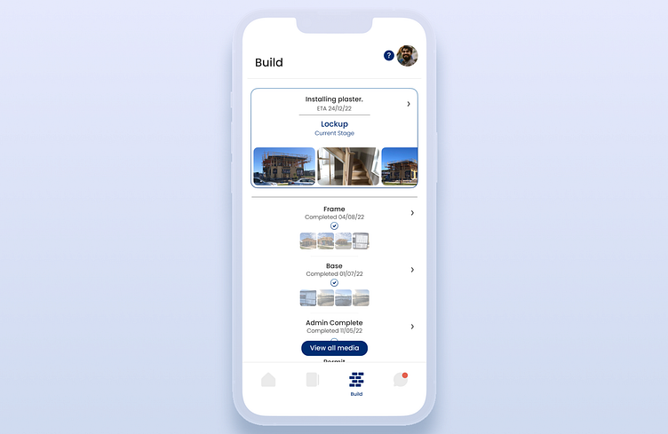
The Solution
Previously, clients would only see their major milestones. There is so much that happens between these stages that a client would only know about by calling their Site Supervisor. The revamping of this module would:
• Leverage the functionality of internal systems.
• Present data in a digestible fashion.
• Serve daily updates to allow clients to feel more included throughout their journey.
• Enrich stage updates with categorised photos and videos.
The Design
The idea behind the way content is displayed on this page is to have it feel like a scrolling archive. It gave the client the ability to see all relevant photos and videos that related to each build stage.
At the top of the screen the client is presented with their current build milestone and latest completed or due to be completed task. The images presented are horizontally scrollable and large enough to preview without needing to expand their size.
There is an accessible "View all media" button that will only show uploaded photos and videos to be viewed as an album.

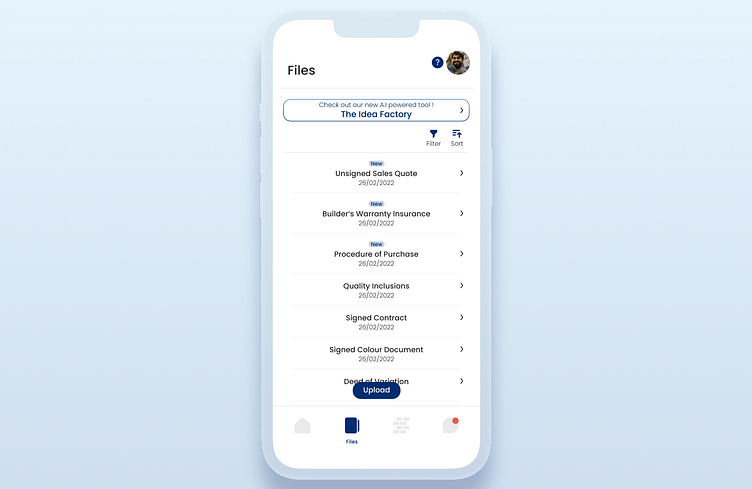
The Solution
Throughout a build, a client is exposed to a wide variety of documents relating to their build. This can be confusing and overwhelming for a lot of people. The way I simplified this was to:
• Present documents only relevant to each build stage.
• Accompanying documents with explanations.
• Mitigate information overload by reducing the amount of text on screen.
• Prompt clients to action documents (Read, sign and upload) to avoid any build delays.
The Design
I wanted the client to be able to identify the document type easily. This is accomplished by having its named in large bold text.
Any new and unopened documents have a prevalent "New" tag associated. This is to prompt them to open the document so that it can be actioned appropriately.
All documents can be filtered or sorted with accessible buttons. The right facing arrows also indicate that each item can be clicked on. This was chosen instead of having each item as a button, to allow for more negative space on the page. This makes it feel less cluttered and the focus is diverted to the right areas.
As you may have noticed, there's a button up top that also links to an AI powered image generator which I'll explain in the next module.
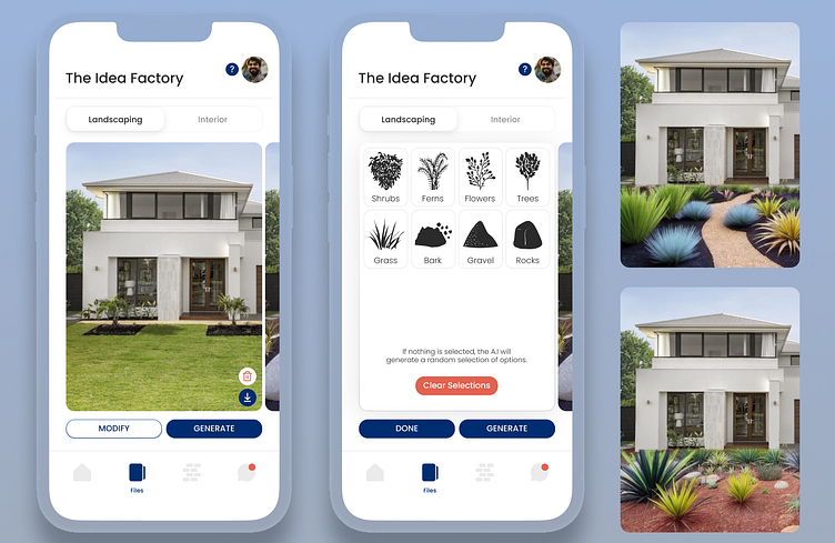
The Solution
Often clients are left to find their own inspiration for things such as landscaping. The idea behind this module was to enable them with the power of Artificial Intelligence to create unique images.
The Design
I needed a way to allow clients to use a complex system in a streamlined way. Limiting the amount of buttons that are able to be pressed was a way to do this.
I created a guided tour of sorts to ensure they don't wander away from the content that matters. The images are the focal point, so they take centre stage.
I had avoided any scrolling necessary on this page and instead opted for a pop-up menu to make any changes.